Ulike
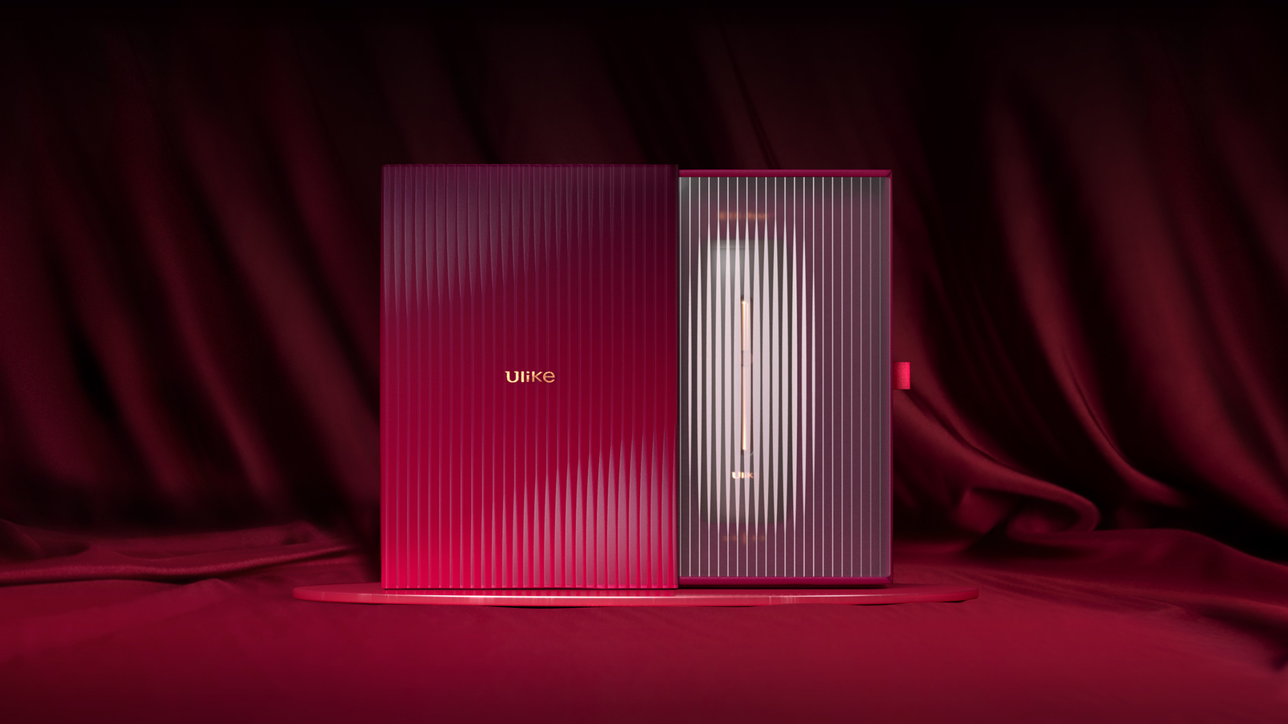
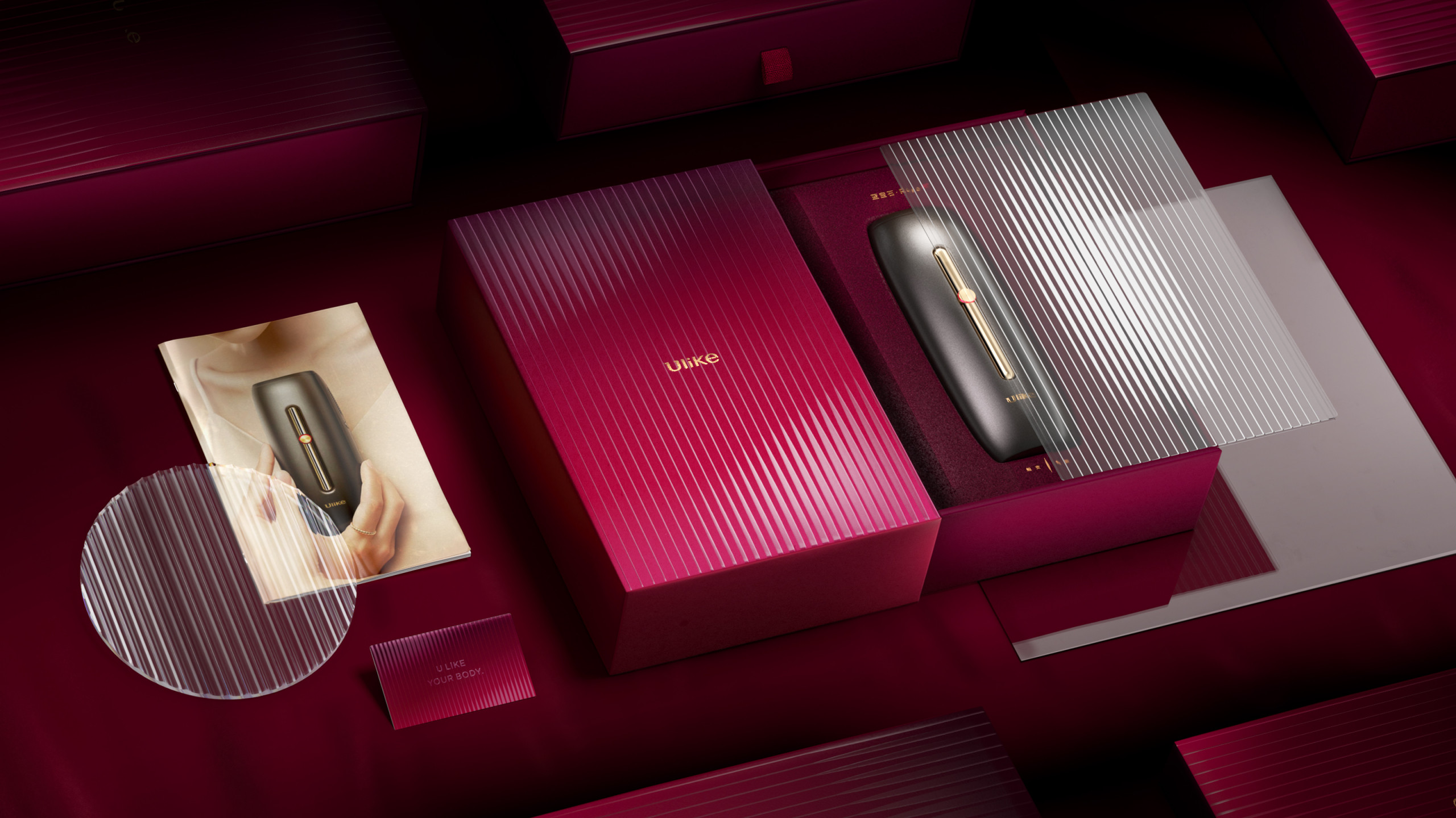
Package design
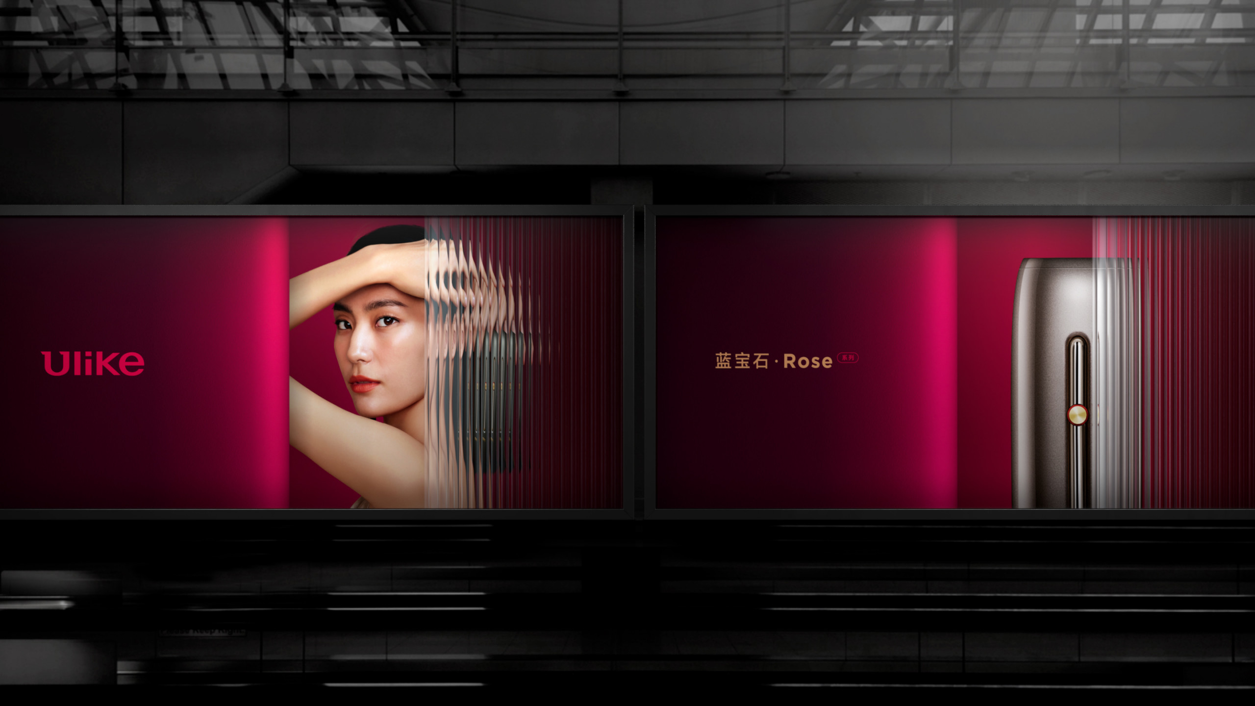
Brand applications
Creating a unique and evolving identity
Ulike is a leading brand in the at-home hair removal industry. It is dedicated to conveying its brand value through cutting-edge technology to provide modern consumers with better solutions for body beauty. In the current rise of new consumer brands, Ulike aims to enhance its competitive edge by strengthening and re-innovating its branding. Additionally, it seeks to create a contemporary and progressive new brand image that aligns more closely with the avant-garde consumer demographic.
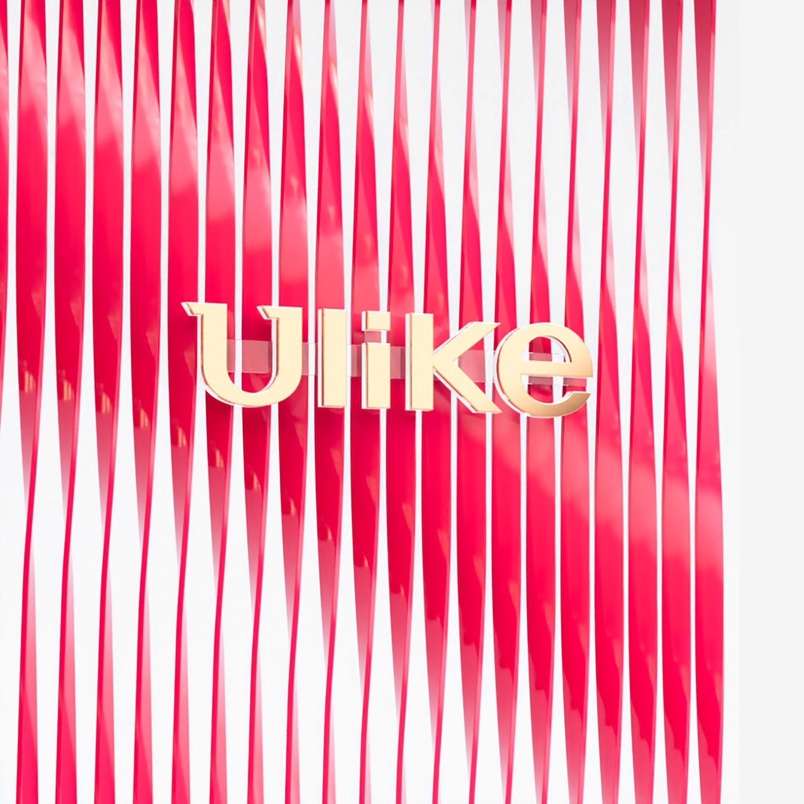
The rebranding aims to rebuild its visual identity, be more attached to the brand’s core value, and speak to its audience, showcasing its fashionable and contemporary brand image. The concept of the branding is inspired by the word – evolving, which represents the intuitive function of the hair removal device, reintroducing a newer and better look for the users. On the other hand, evolving shows the willing of the brand to keep innovation for providing advanced values for the consumers. We integrated the concept of evolving with the gradient effect of the fluted glass and created a brand-new visual language for Ulike. The reflection of the glass created a dreamy and premium feelings, and the solid and void effect enriched the depth of the graphic. As the new brand applications, we adapted the concept of evolving with different material dimensions, such as graphics, packaging, and space. The unique visual element created a consistent brand identity with fun and diverse extensions, promoted its core value, and showcased a fashionable and contemporary brand image
Ulike
Creating a unique and evolving identity
Package design
Brand applications
Ulike is a leading brand in the at-home hair removal industry. It is dedicated to conveying its brand value through cutting-edge technology to provide modern consumers with better solutions for body beauty. In the current rise of new consumer brands, Ulike aims to enhance its competitive edge by strengthening and re-innovating its branding. Additionally, it seeks to create a contemporary and progressive new brand image that aligns more closely with the avant-garde consumer demographic.
The rebranding aims to rebuild its visual identity, be more attached to the brand’s core value, and speak to its audience, showcasing its fashionable and contemporary brand image. The concept of the branding is inspired by the word – evolving, which represents the intuitive function of the hair removal device, reintroducing a newer and better look for the users. On the other hand, evolving shows the willing of the brand to keep innovation for providing advanced values for the consumers. We integrated the concept of evolving with the gradient effect of the fluted glass and created a brand-new visual language for Ulike. The reflection of the glass created a dreamy and premium feelings, and the solid and void effect enriched the depth of the graphic. As the new brand applications, we adapted the concept of evolving with different material dimensions, such as graphics, packaging, and space. The unique visual element created a consistent brand identity with fun and diverse extensions, promoted its core value, and showcased a fashionable and contemporary brand image