KAILAS
Brand applications
Redefining a top global
outdoor apparel brand
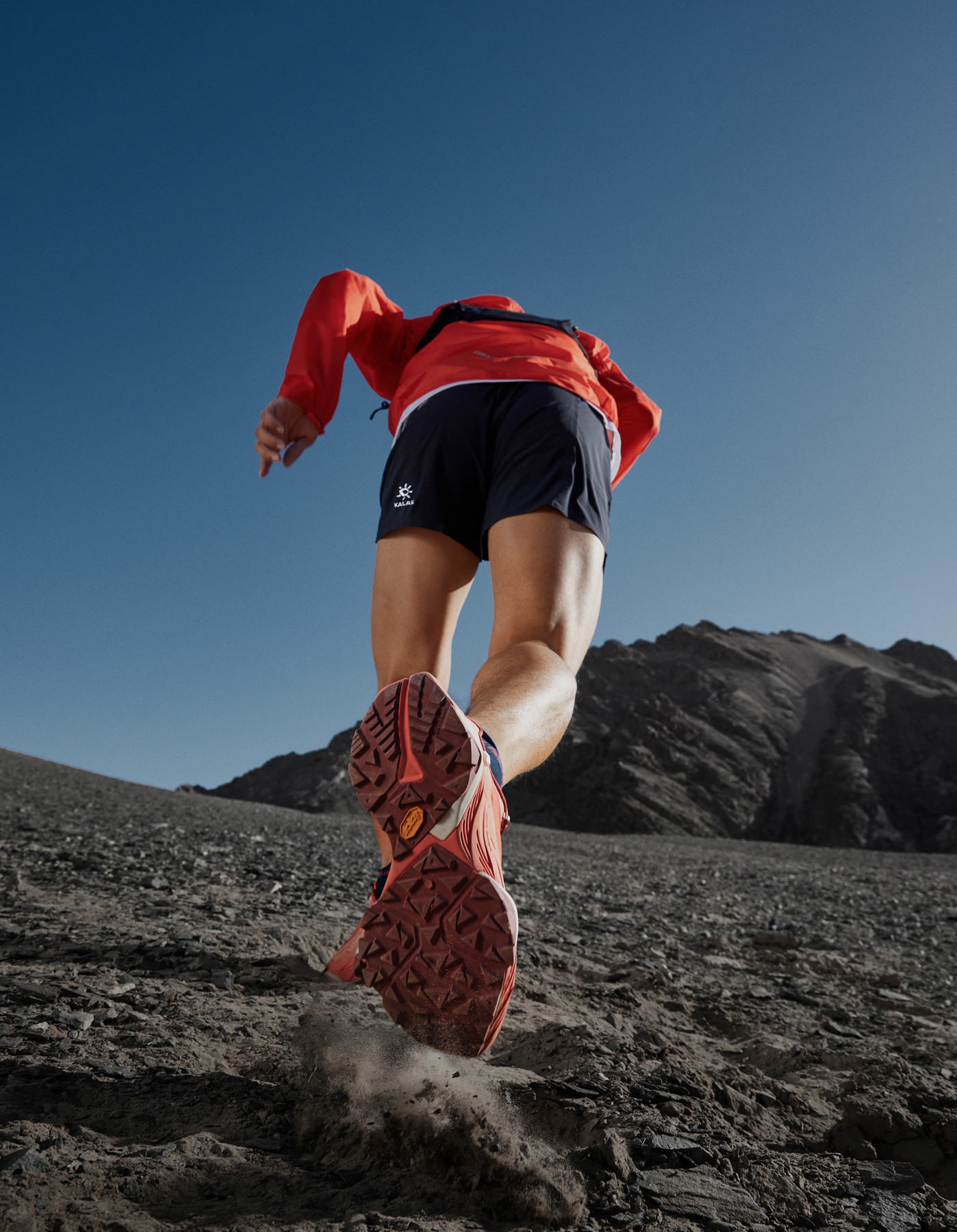
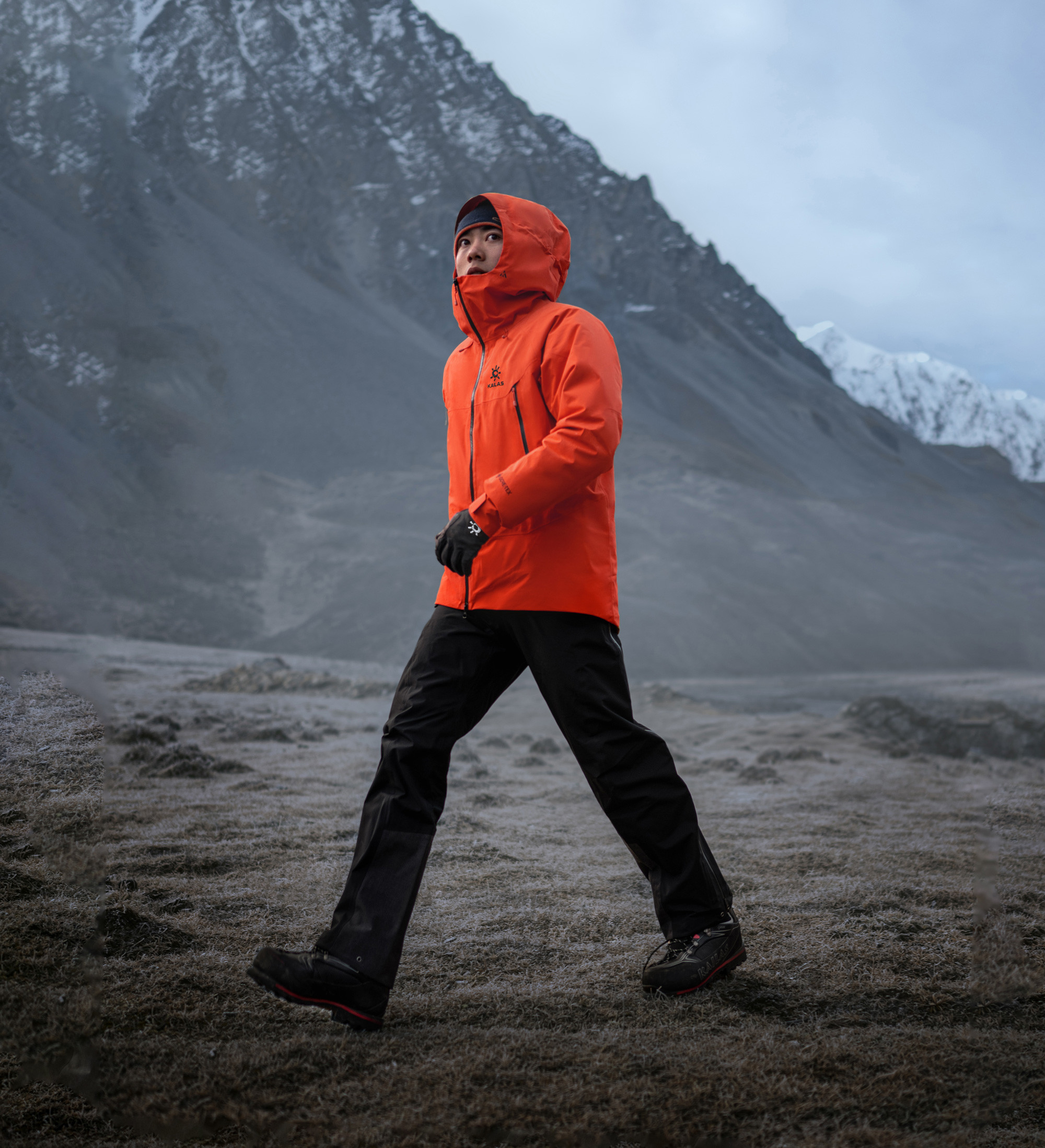
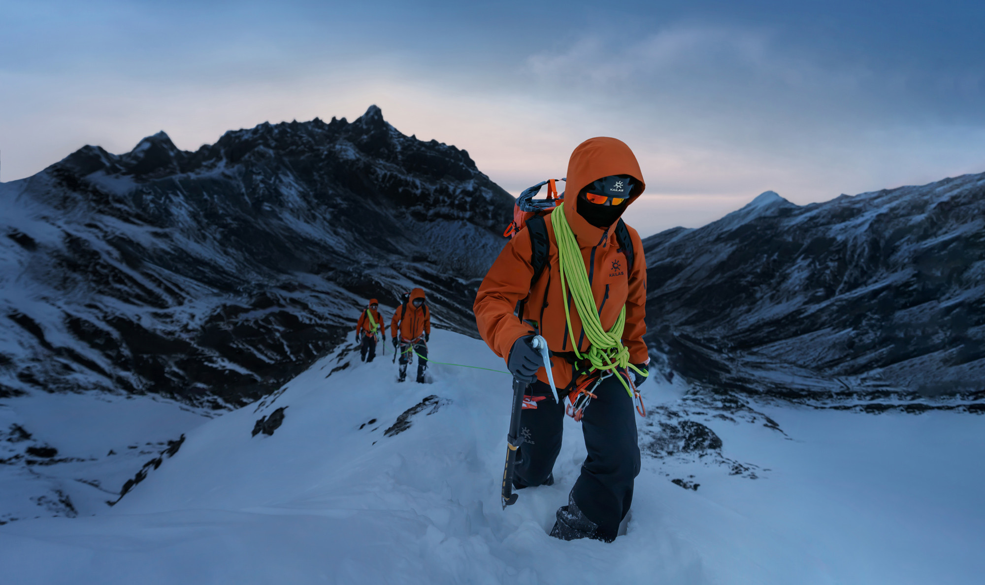
KAILAS is one of the world’s leading outdoor apparel brands. Founded in Guangzhou, China, in 2003, KAILAS is committed to providing outdoor enthusiasts with the best quality and innovative products that help them climb higher, run faster, and trek further.
Facing the rapid growth of the outdoor sports market, KAILAS wanted to repurpose its brand value and bring out a stronger and more clear brand identity system.
We worked together with their team on the brand strategy and research, redefining their values and design principles, emphasizing four keywords: passion, inspiration, focus, and perseverance. We aimed to bring more meaningful value to brands, creating unique and emotional connections between the customer and the brand.
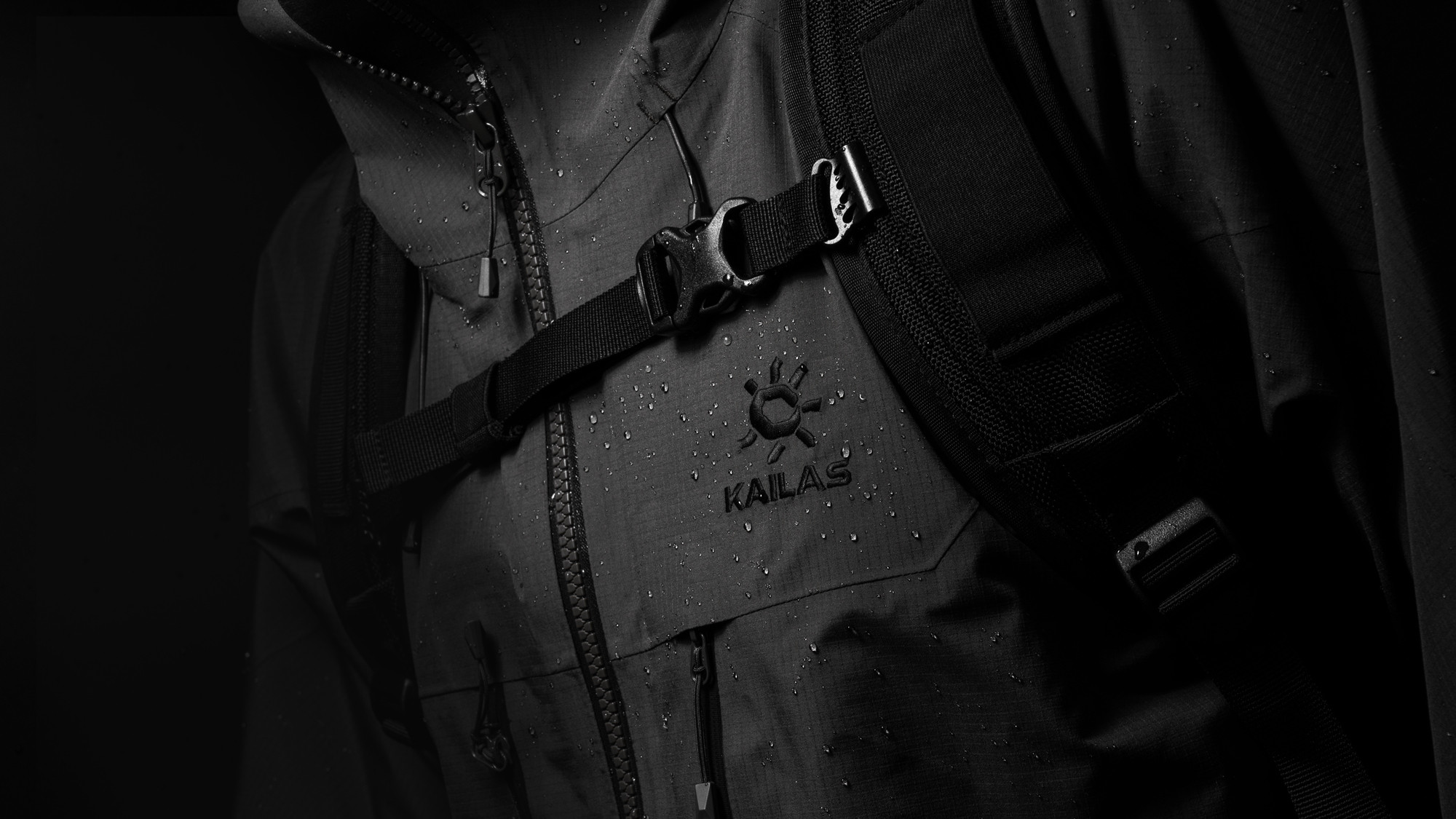
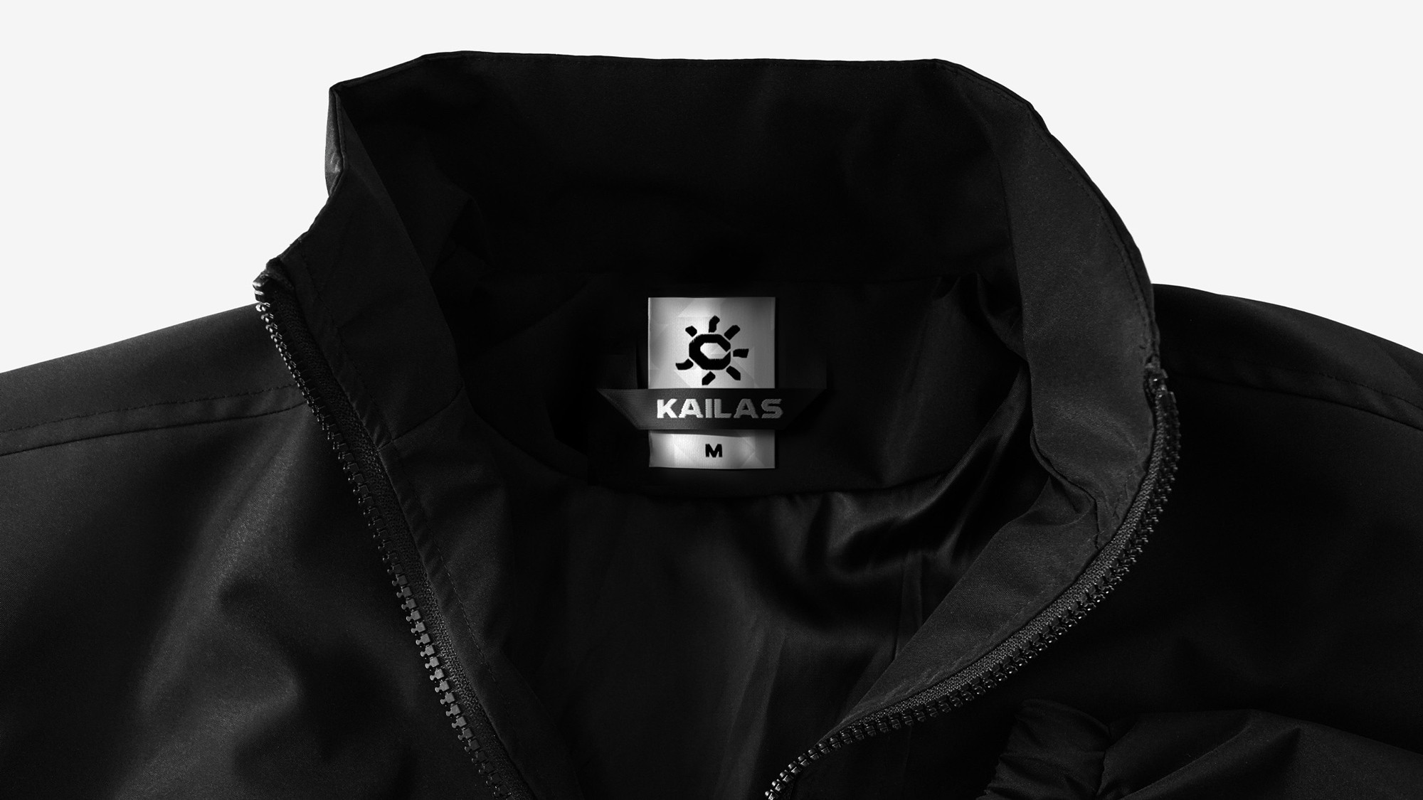
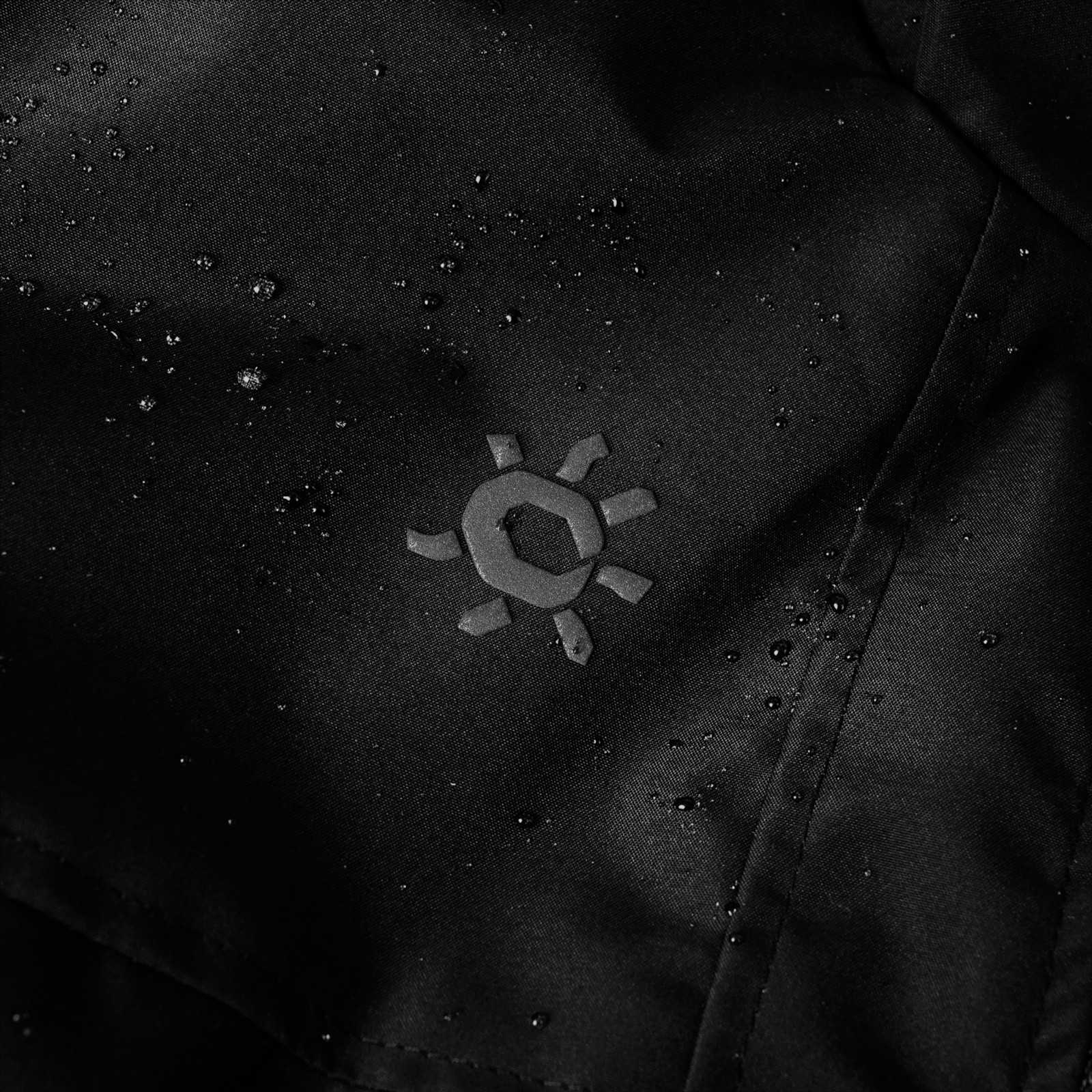
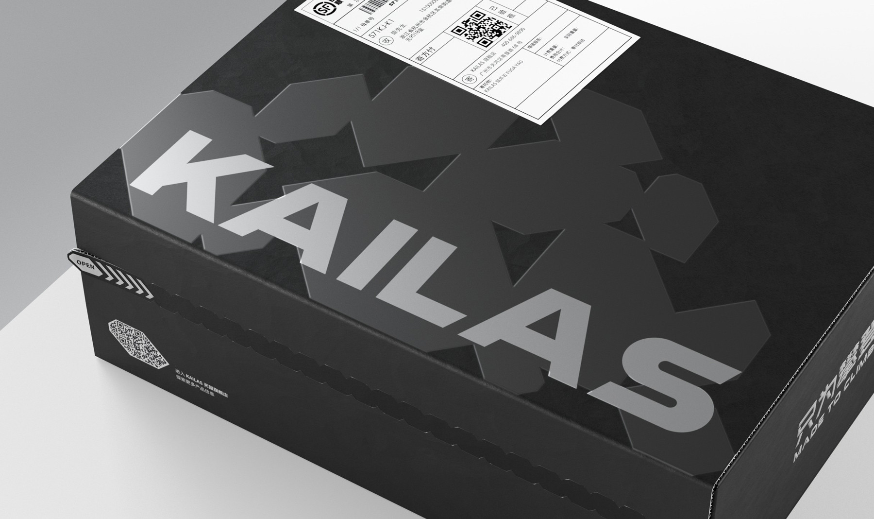
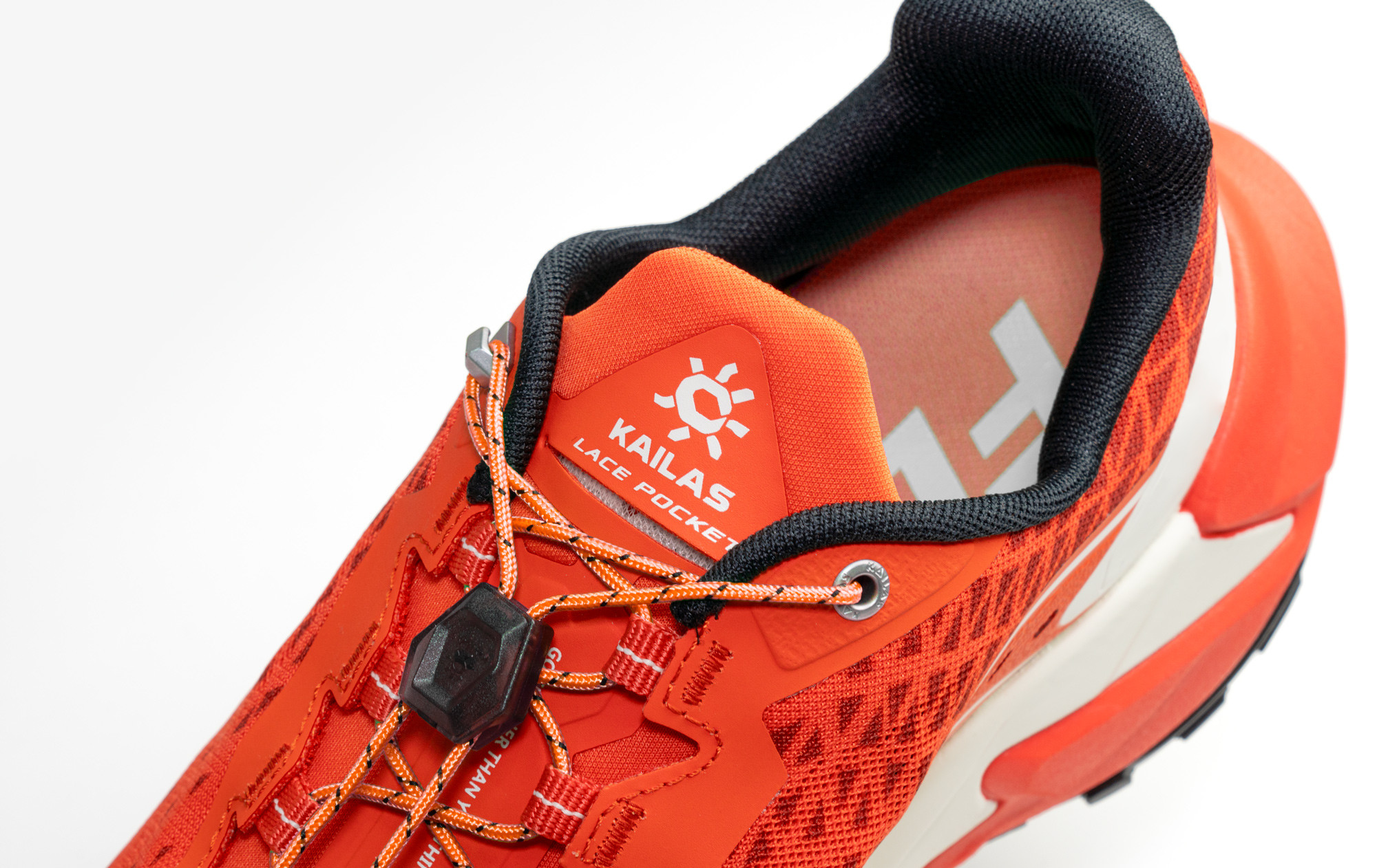
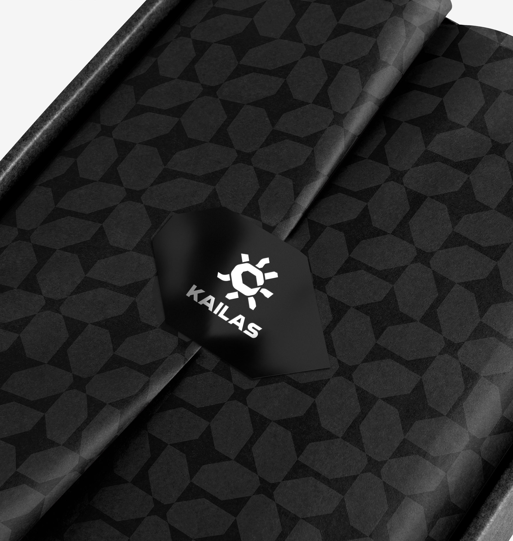
The new design maintains the recognizable symbol of the sun but optimizes its curves, frame, and proportions, giving a greater feeling of strength and distinction.
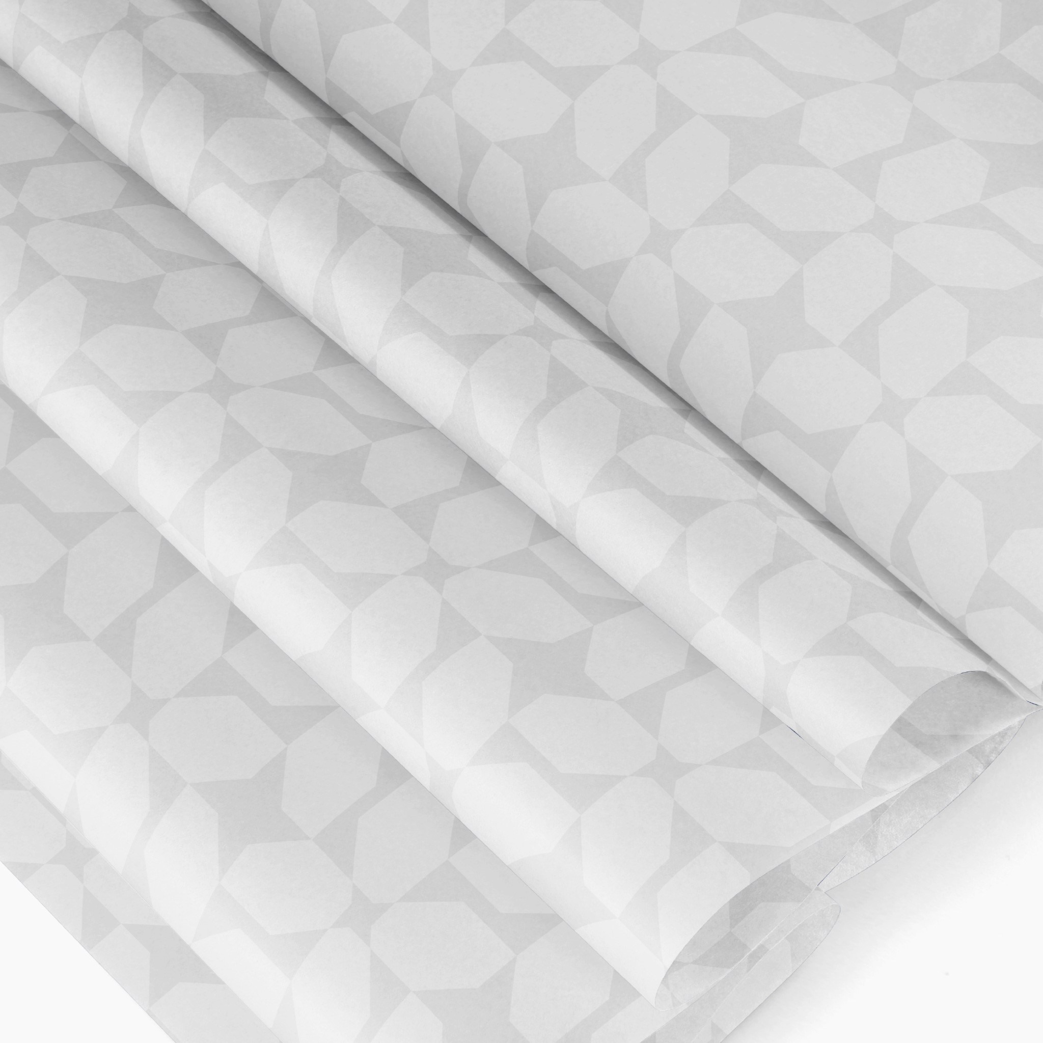
Furthermore, we brought the concept of being as ‘strong as a rock.’ The negative shape is inspired by the rock. This gives an additional meaning to the logo, which is connected directly with the brand, symbolizing the brand’s inner spirit of perseverance and focus.
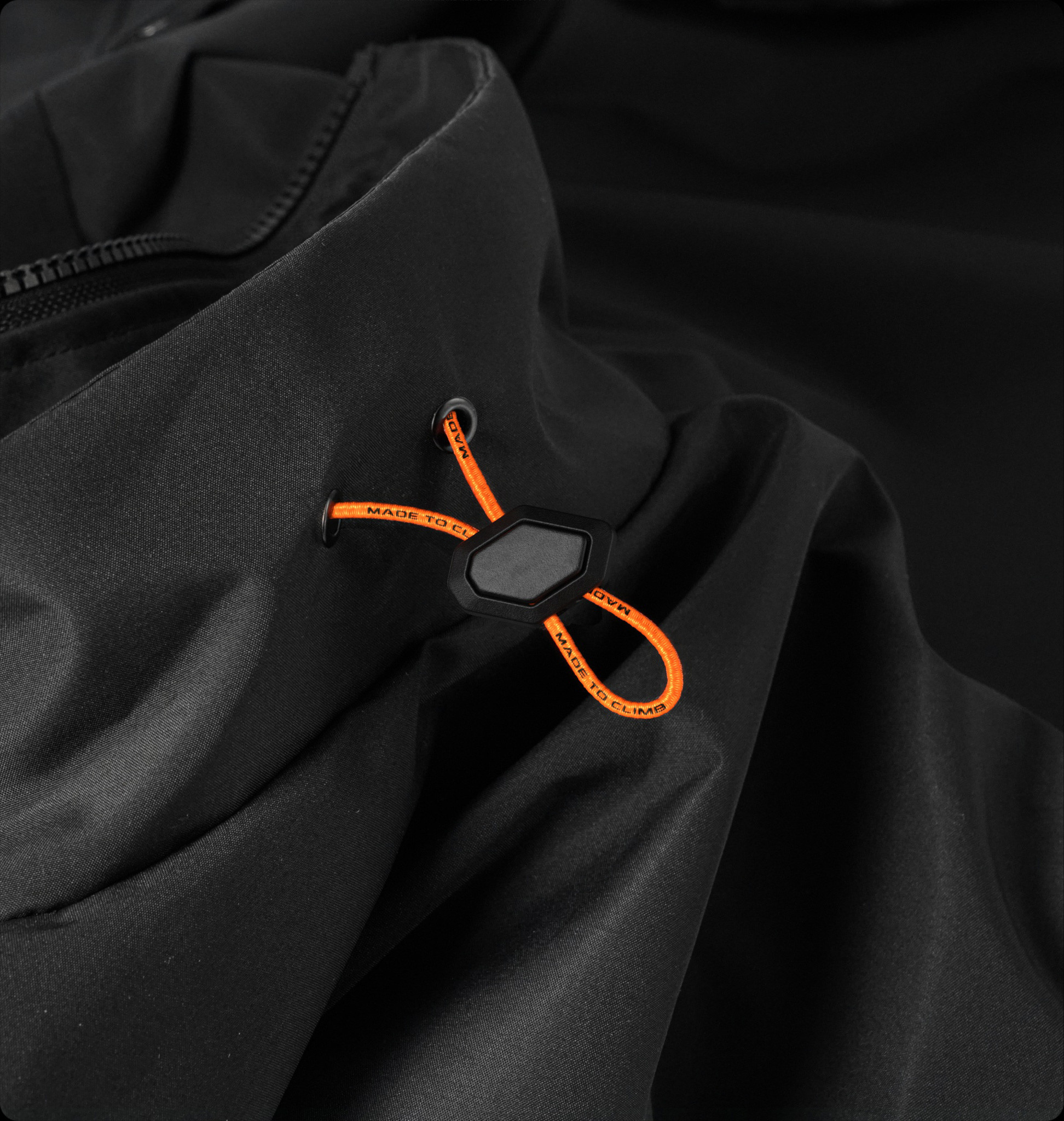
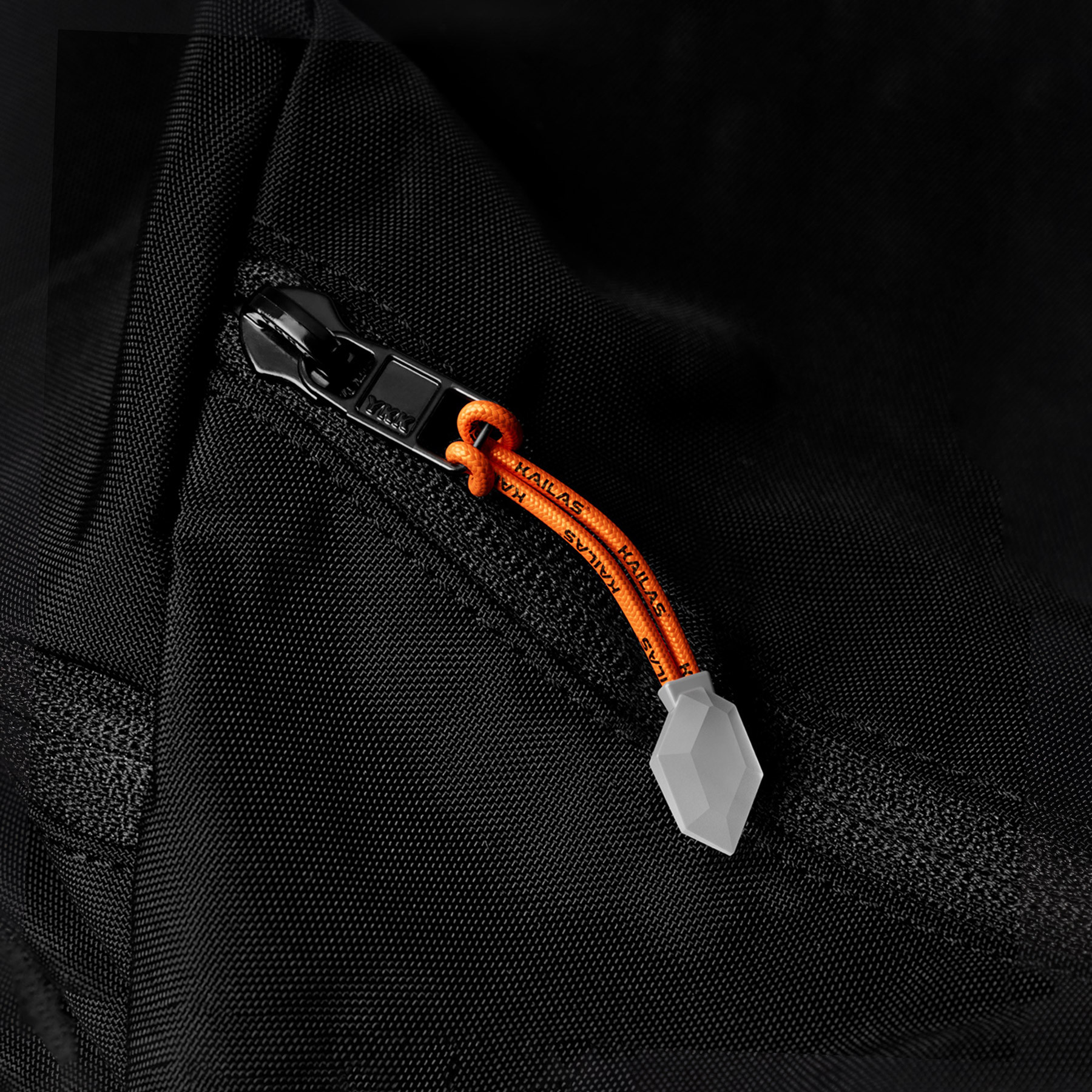
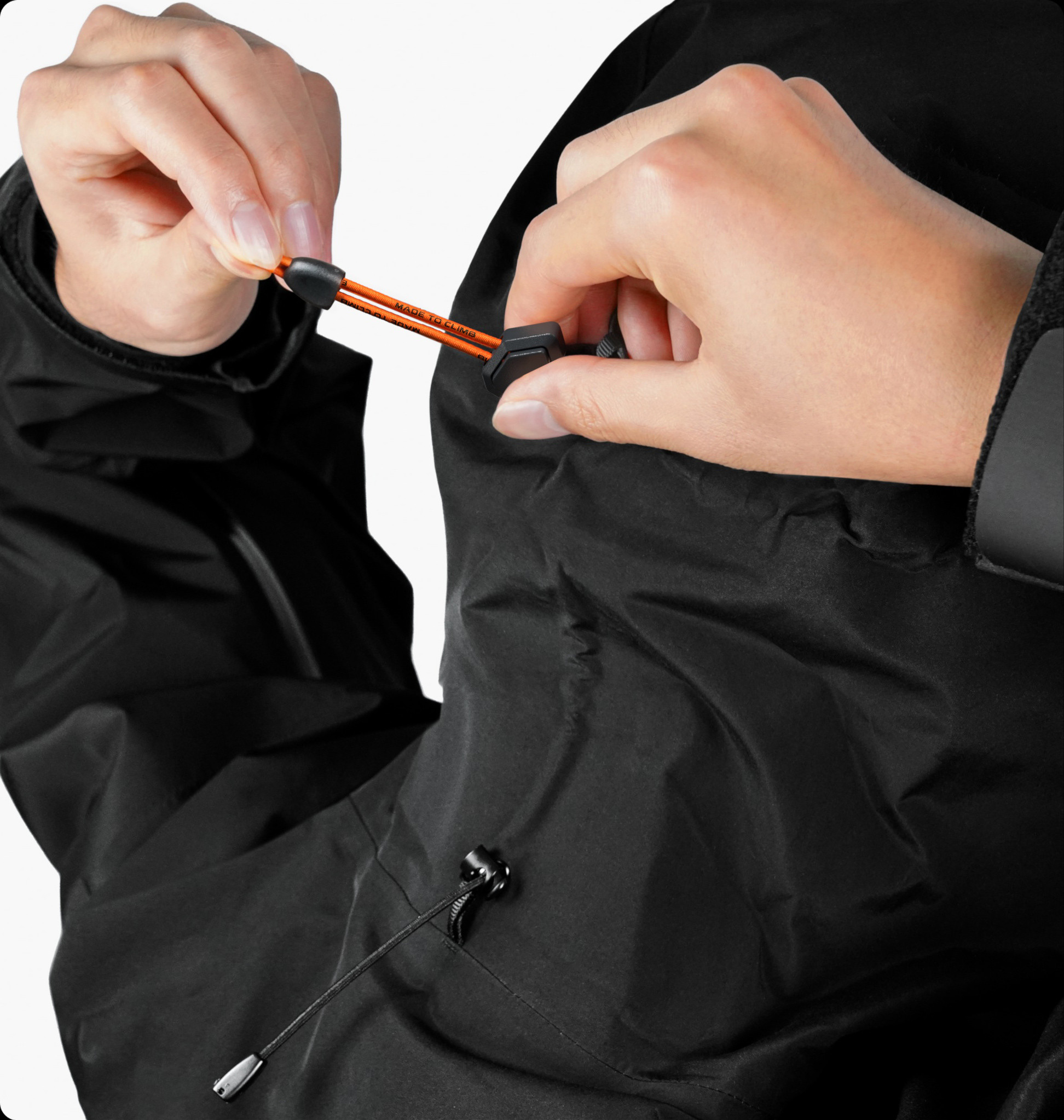
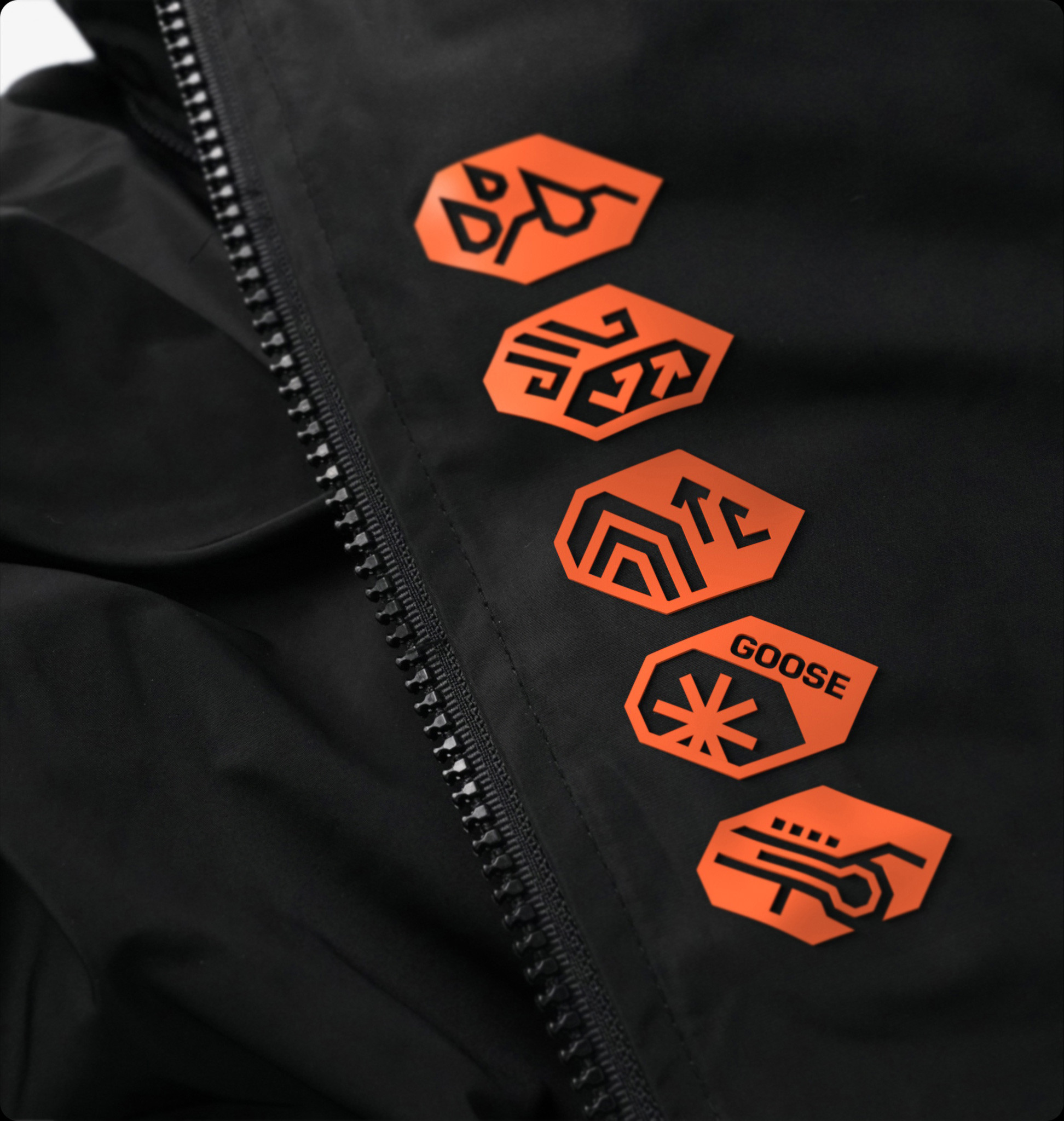
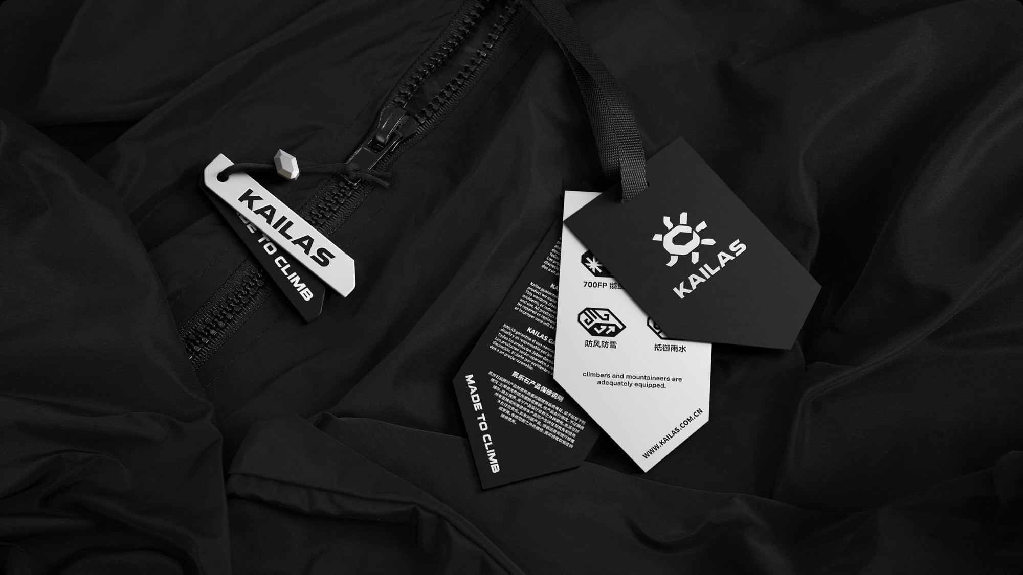
This concept enhances the brand identity, making it more meaningful, flexible, and iconic. Expanding into a broader range of visual graphic, product, and space applications.
KAILAS
Redefining a top global
outdoor apparel brand
Brand applications
KAILAS is one of the world’s leading outdoor apparel brands. Founded in Guangzhou, China, in 2003, KAILAS is committed to providing outdoor enthusiasts with the best quality and innovative products that help them climb higher, run faster, and trek further.
Facing the rapid growth of the outdoor sports market, KAILAS wanted to repurpose its brand value and bring out a stronger and more clear brand identity system.
We worked together with their team on the brand strategy and research, redefining their values and design principles, emphasizing four keywords: passion, inspiration, focus, and perseverance. We aimed to bring more meaningful value to brands, creating unique and emotional connections between the customer and the brand.
The new design maintains the recognizable symbol of the sun but optimizes its curves, frame, and proportions, giving a greater feeling of strength and distinction.
Furthermore, we brought the concept of being as ‘strong as a rock.’ The negative shape is inspired by the rock. This gives an additional meaning to the logo, which is connected directly with the brand, symbolizing the brand’s inner spirit of perseverance and focus.
This concept enhances the brand identity, making it more meaningful, flexible, and iconic. Expanding into a broader range of visual graphic, product, and space applications.