Joyoung
Brand applications
Introducing a meaningful and global identity
Our objective was to strengthen the brand’s core elements, simplify, and shape it into a more refined, youthful, and easier-to-communicate brand image. Joyoung is one of the pioneers of the Chinese appliance industry. Its reliability helped maintain its unshakable authority for over 30 years.
In the face of competitive marketing, businesses are presented with a unique opportunity for growth and adaptation. Rebranding is the key to accommodating the younger generation, keeping up with the latest trends, and breathing new life into the old-fashioned. The client’s request to maintain the newly designed logo and use it as the foundation for a brand-new visual system is a testament to their forward-thinking approach. This allows us to refine the brand style and align it with its modern image, sparking excitement for the future of Joyoung.
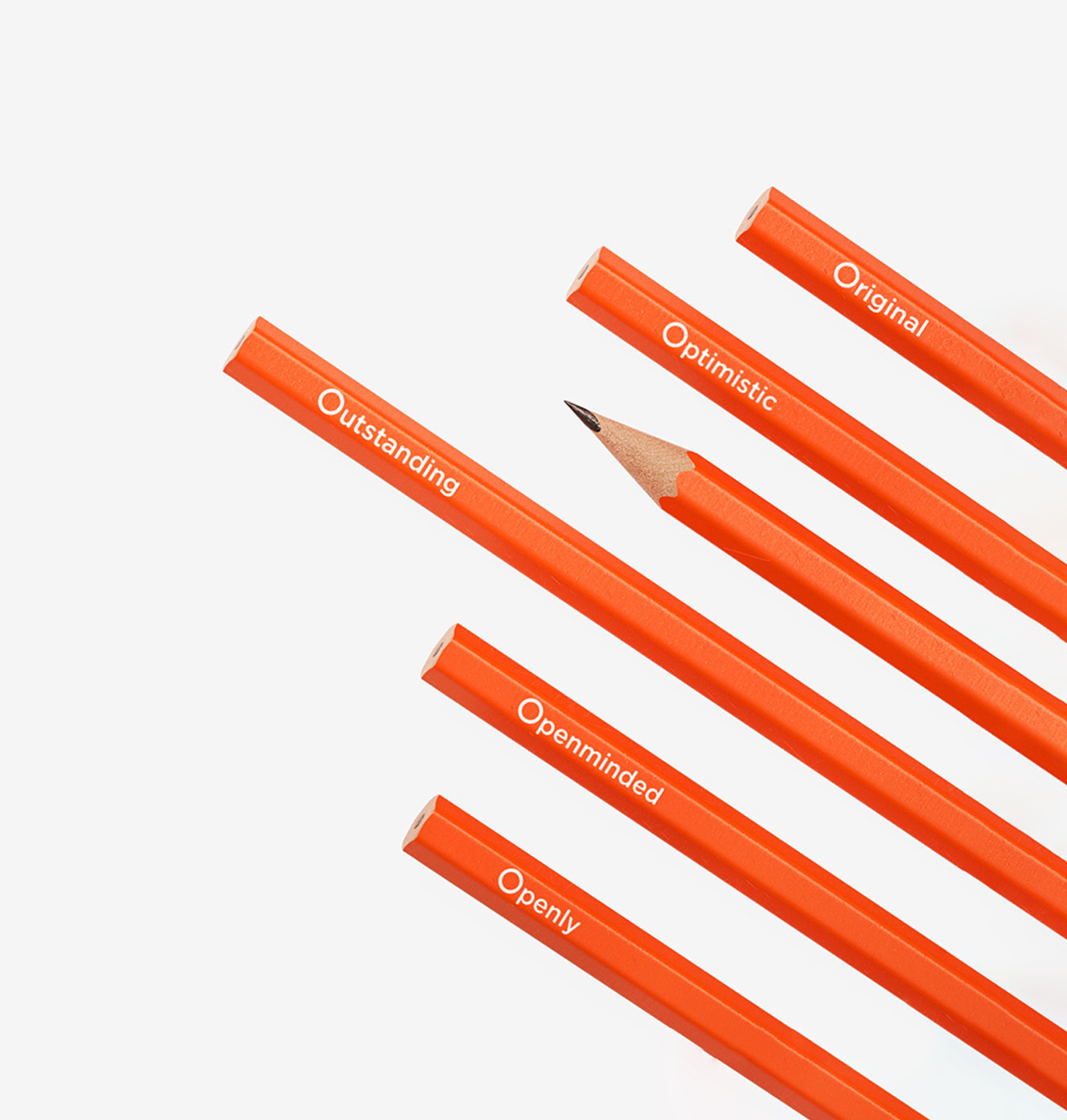
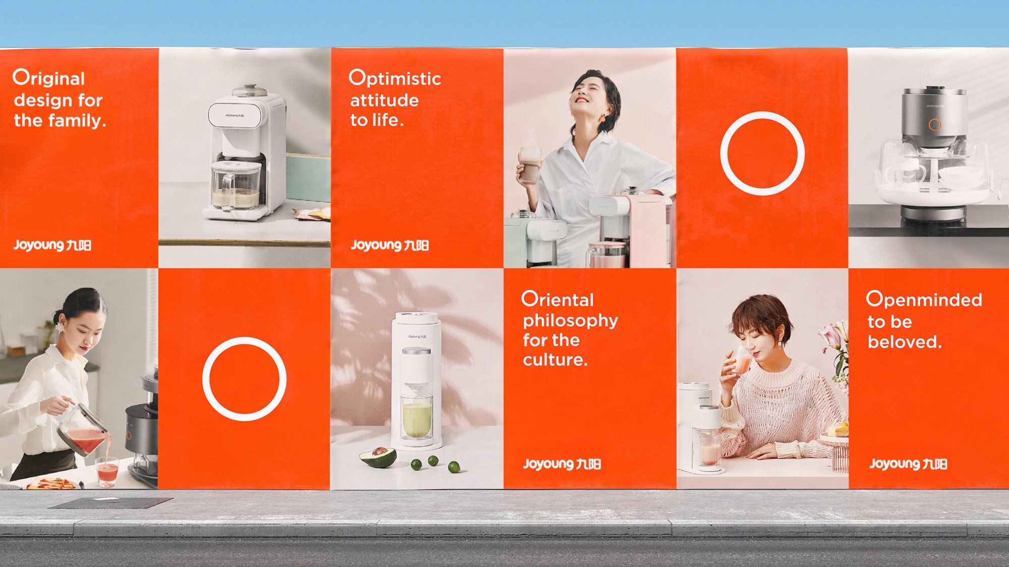
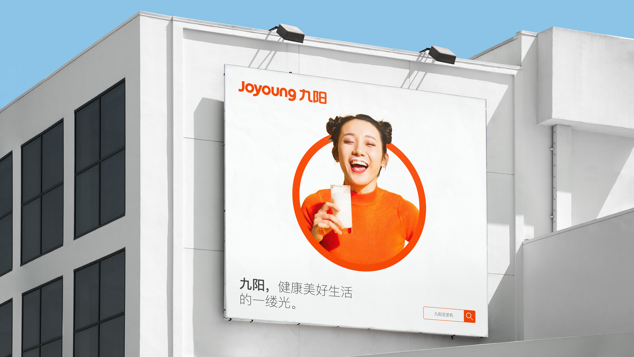
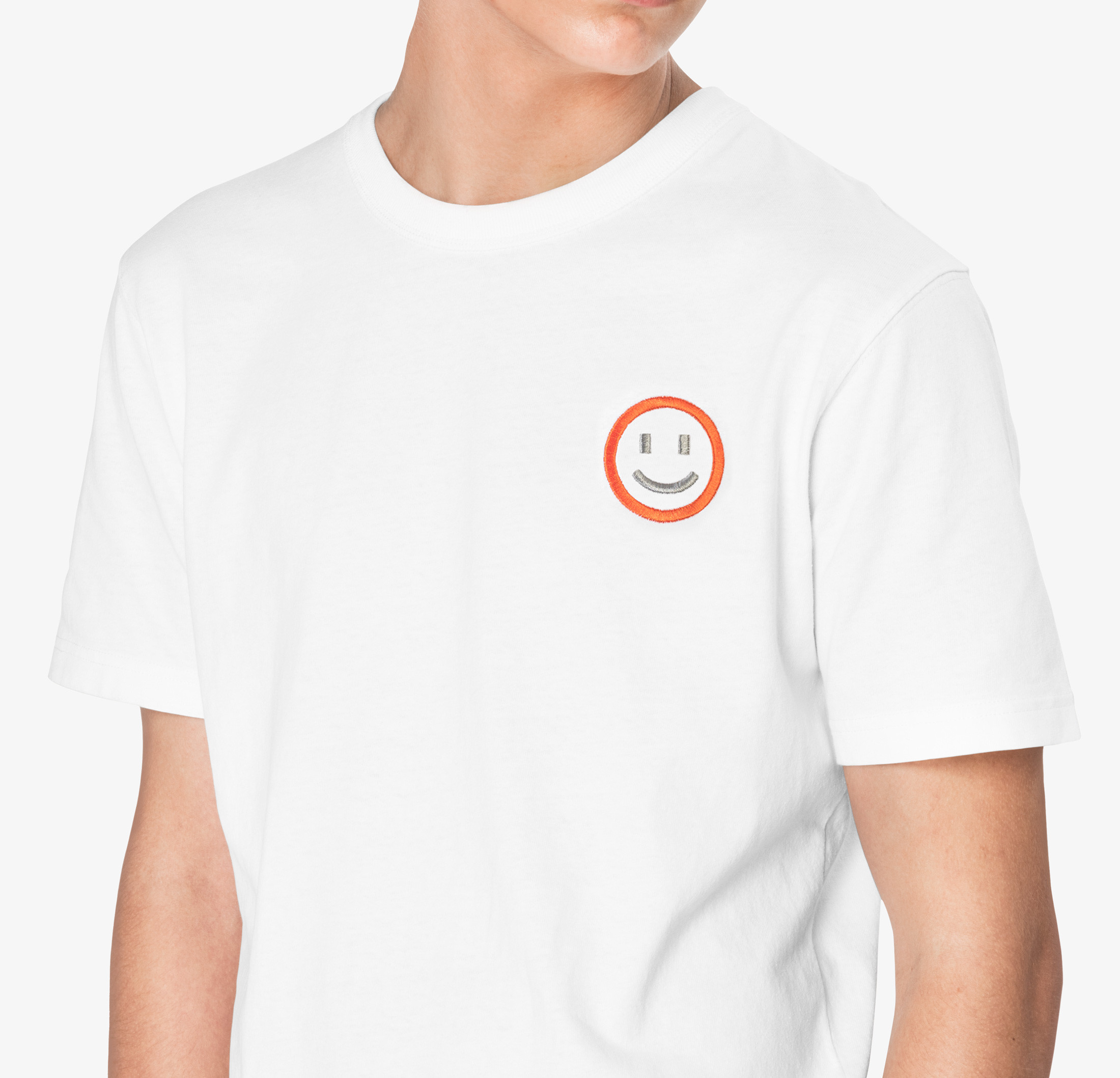
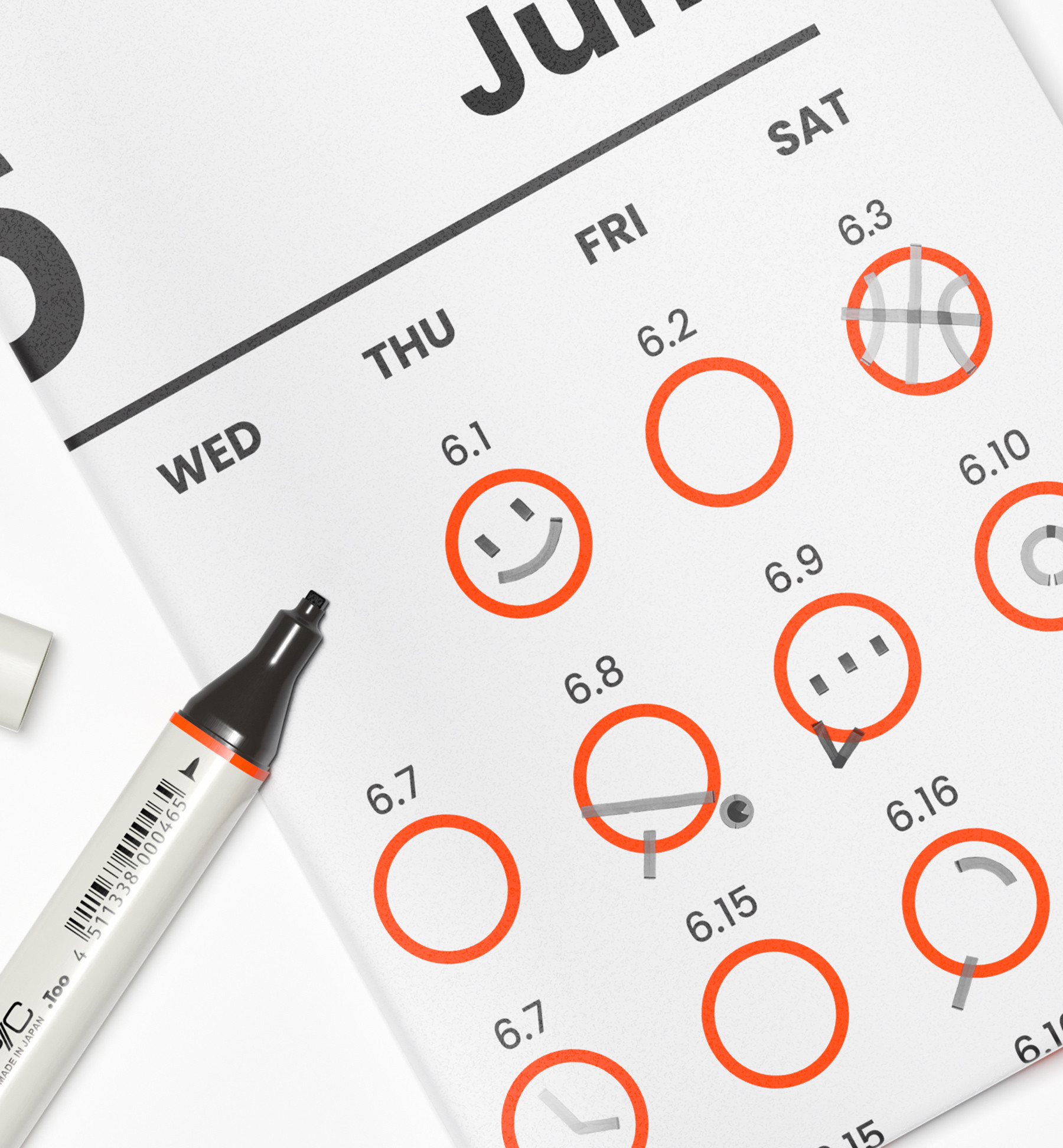
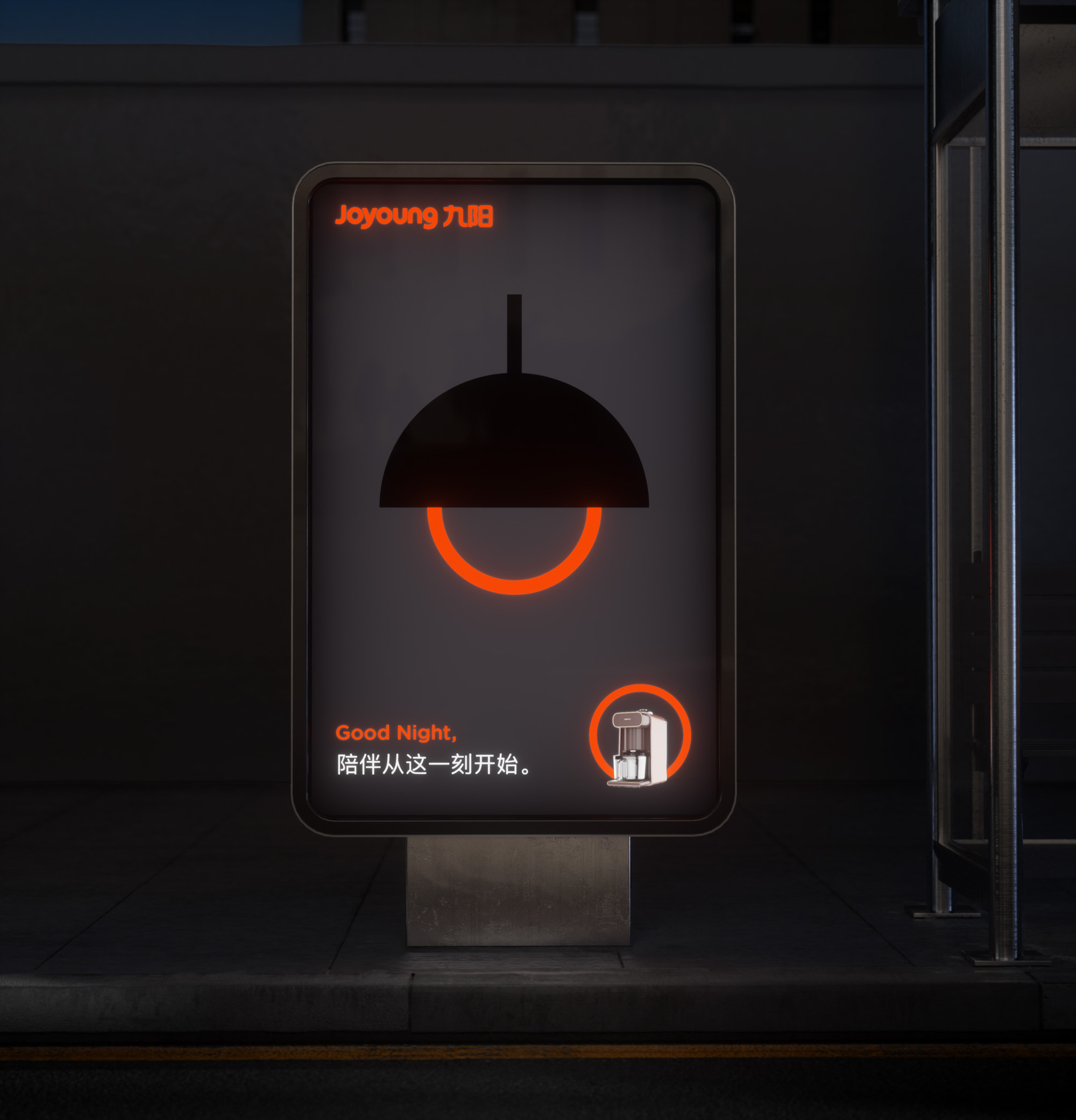
Joyoung is a made-up word; the brand name is always displayed with its Chinese name. Its length and ambiguity have always been a problem for brand recognition. Therefore, simplifying and bringing fresh ideas on how to innovate the brand image is our biggest challenge. When the name Joyoung was created, it was because the founder’s name had the meaning of the sun. The symbolic visual expression of the sun has always been a part of Joyoung’s warm, caring, and devoted brand image. During the rebranding process, we were inspired by the middle letter “O”; visually, it appeared like a rising sun, vividly illustrating the brand’s language. The purpose is to refine the brand to be more significant and relevant to the brand history and reestablish a more modernized image to conform with the current culture. We extracted the essence and took it as the new starting point to expand, simplify, and elevate. Eventually, we were able to give Joyoung another life. Simpler, brighter, and better.
Joyoung
Introducing a meaningful and global identity
Brand applications
Our objective was to strengthen the brand’s core elements, simplify, and shape it into a more refined, youthful, and easier-to-communicate brand image. Joyoung is one of the pioneers of the Chinese appliance industry. Its reliability helped maintain its unshakable authority for over 30 years.
In the face of competitive marketing, businesses are presented with a unique opportunity for growth and adaptation. Rebranding is the key to accommodating the younger generation, keeping up with the latest trends, and breathing new life into the old-fashioned. The client’s request to maintain the newly designed logo and use it as the foundation for a brand-new visual system is a testament to their forward-thinking approach. This allows us to refine the brand style and align it with its modern image, sparking excitement for the future of Joyoung.
Joyoung is a made-up word; the brand name is always displayed with its Chinese name. Its length and ambiguity have always been a problem for brand recognition. Therefore, simplifying and bringing fresh ideas on how to innovate the brand image is our biggest challenge. When the name Joyoung was created, it was because the founder’s name had the meaning of the sun. The symbolic visual expression of the sun has always been a part of Joyoung’s warm, caring, and devoted brand image. During the rebranding process, we were inspired by the middle letter “O”; visually, it appeared like a rising sun, vividly illustrating the brand’s language. The purpose is to refine the brand to be more significant and relevant to the brand history and reestablish a more modernized image to conform with the current culture. We extracted the essence and took it as the new starting point to expand, simplify, and elevate. Eventually, we were able to give Joyoung another life. Simpler, brighter, and better.