Teambition
Brand applications
Enhancing a new team
collaboration platform
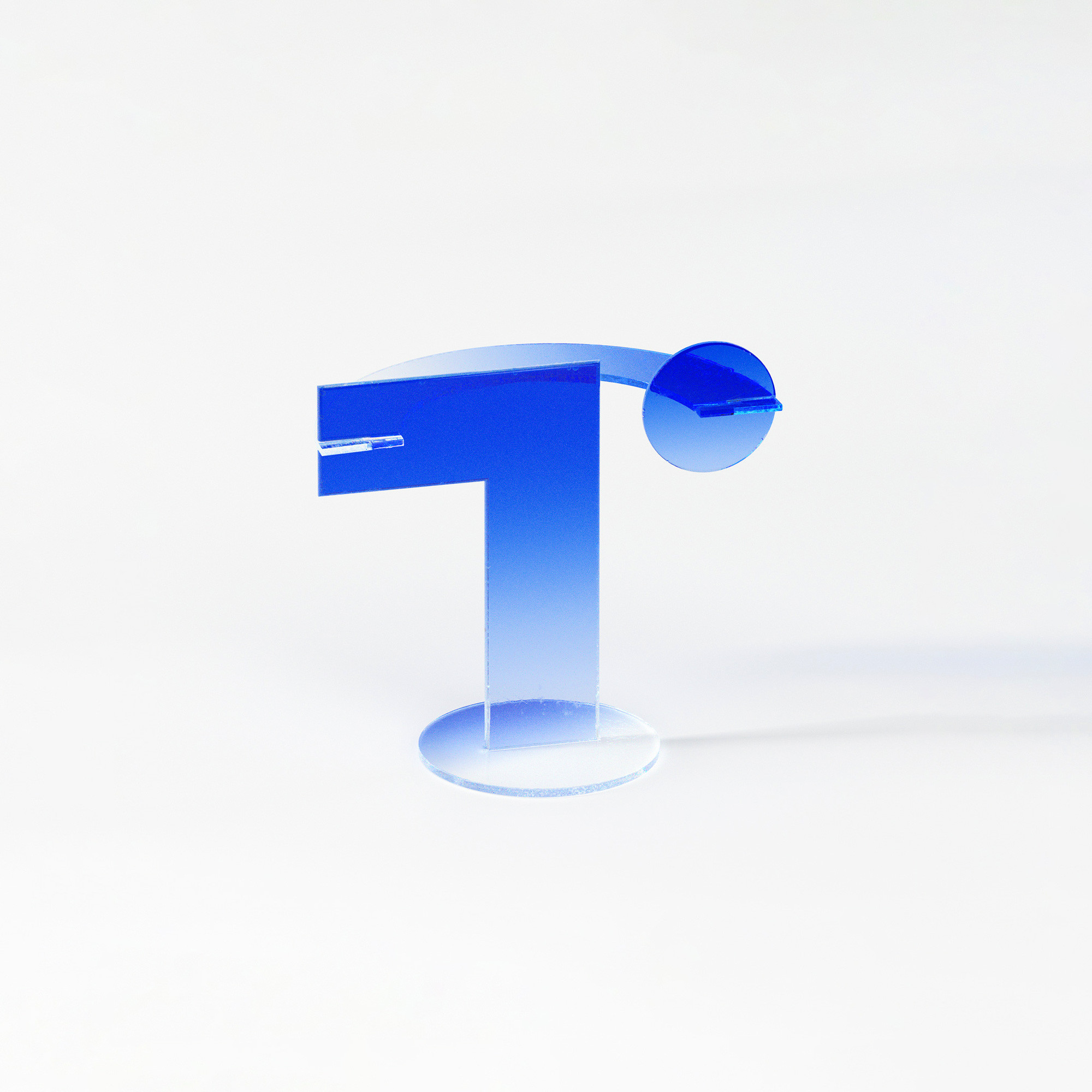
Teambition is a pioneer of team collaboration platforms in China. By facilitating the easy sharing and discussion of tasks, file sharing, and scheduling, Teambition enables teams to unlock unlimited potential in their collaboration efforts. The brand’s new logo also embodies greater possibilities. As the name suggests, the logo features the initial ‘T’ combined with a dot representing ‘team’ and an upward arrow symbolizing ‘ambition,’ creating a unique brand emblem. The gradient colors depict an upward, dynamic visual, symbolizing a positive and goal-oriented vision for team collaboration.
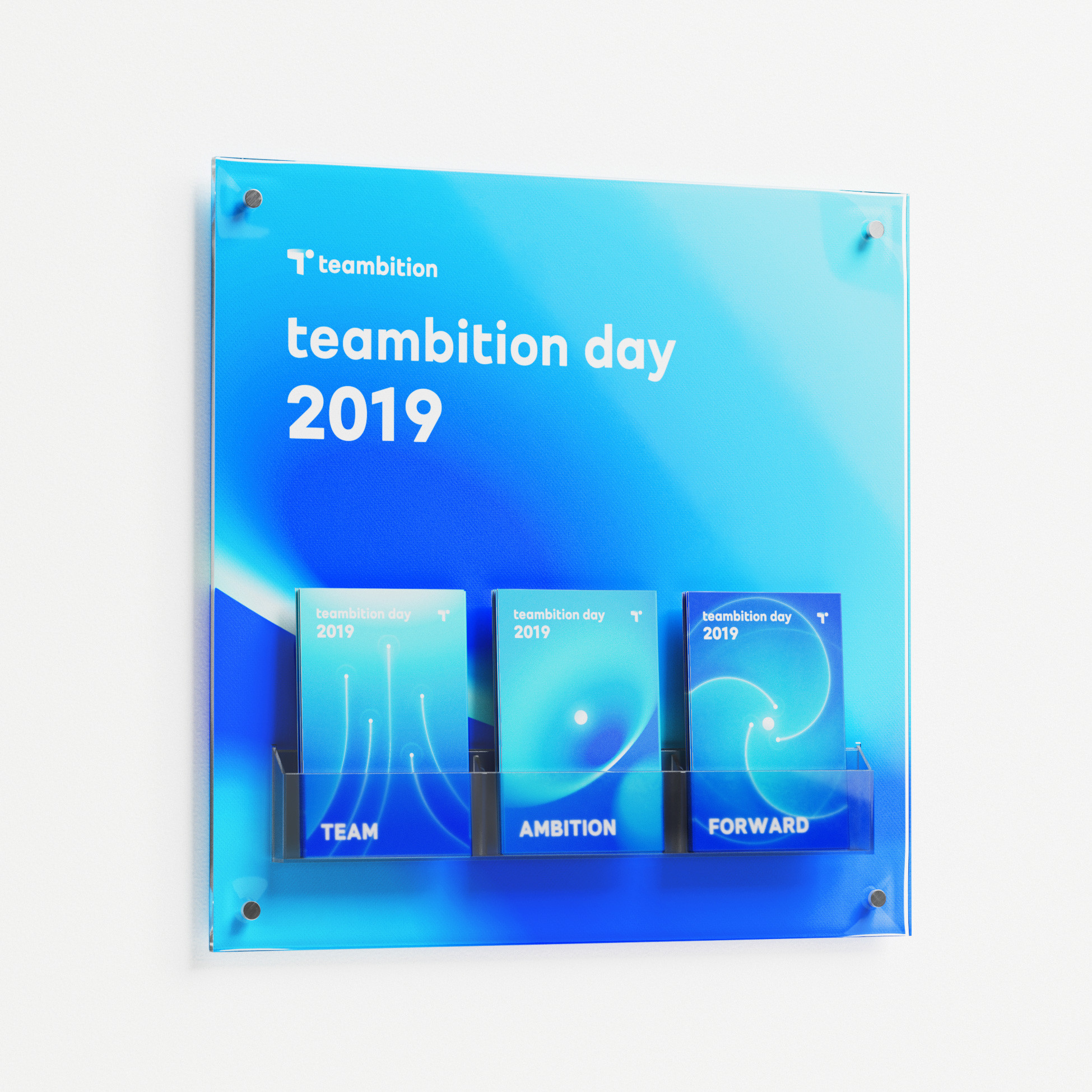
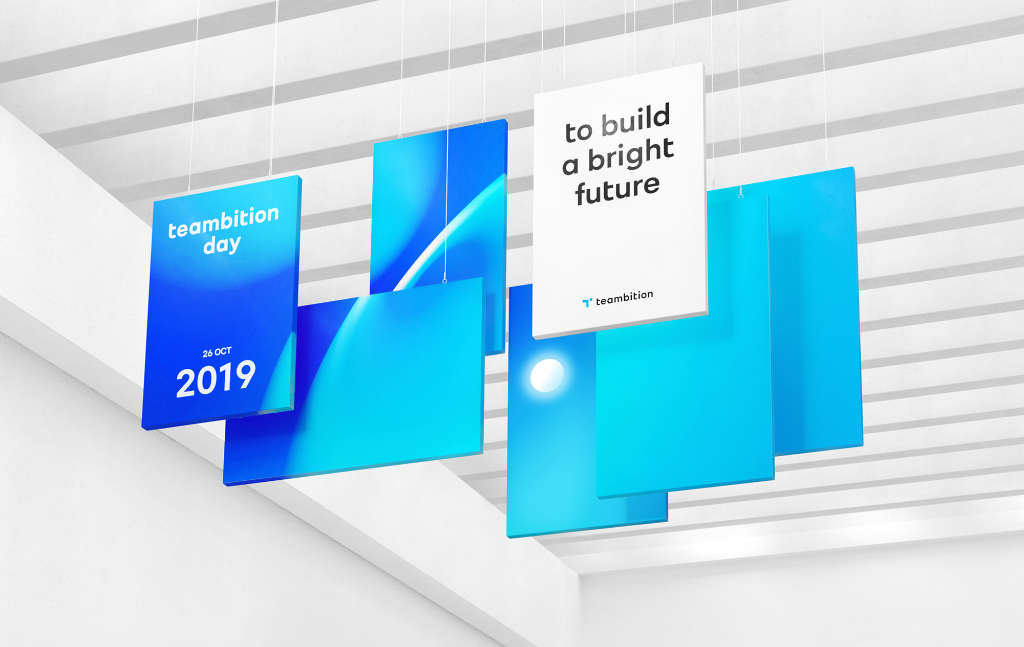
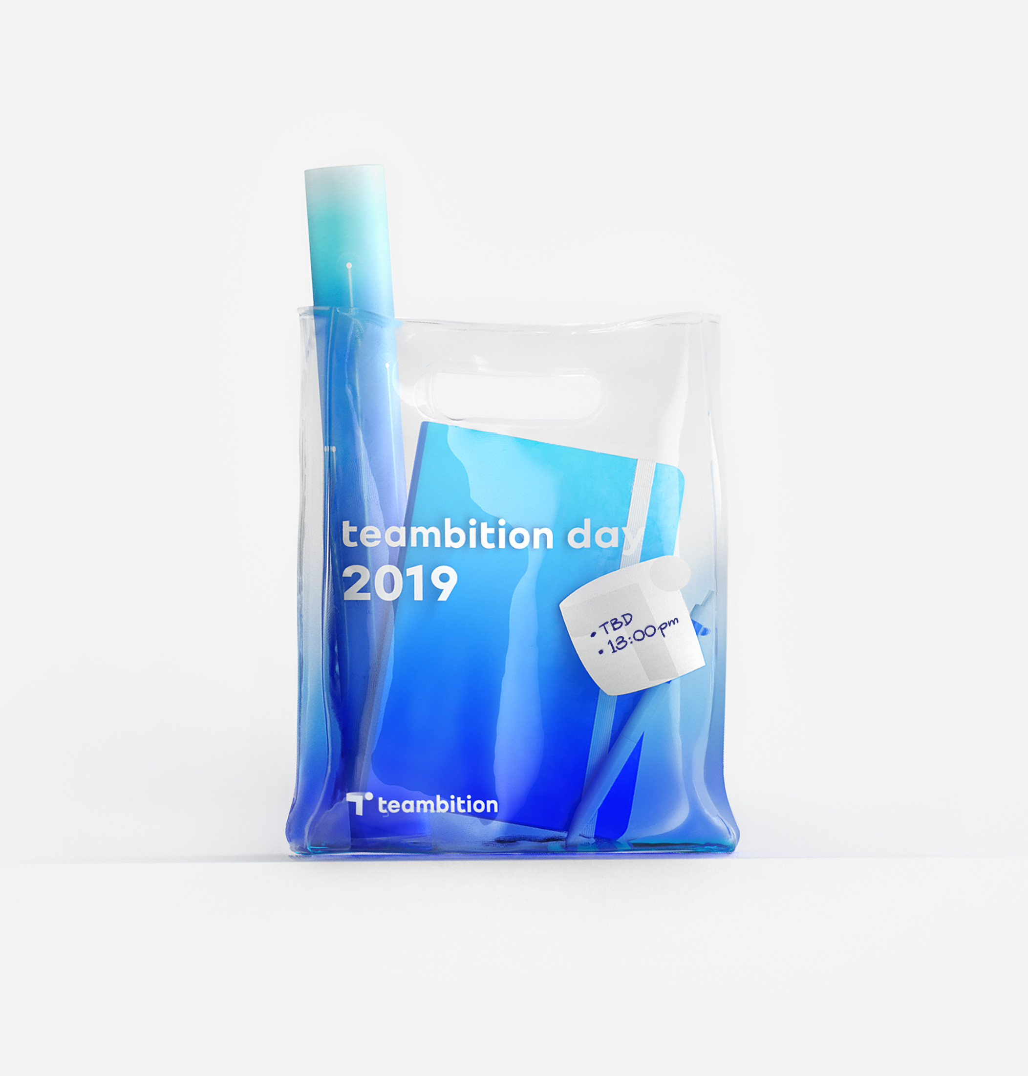
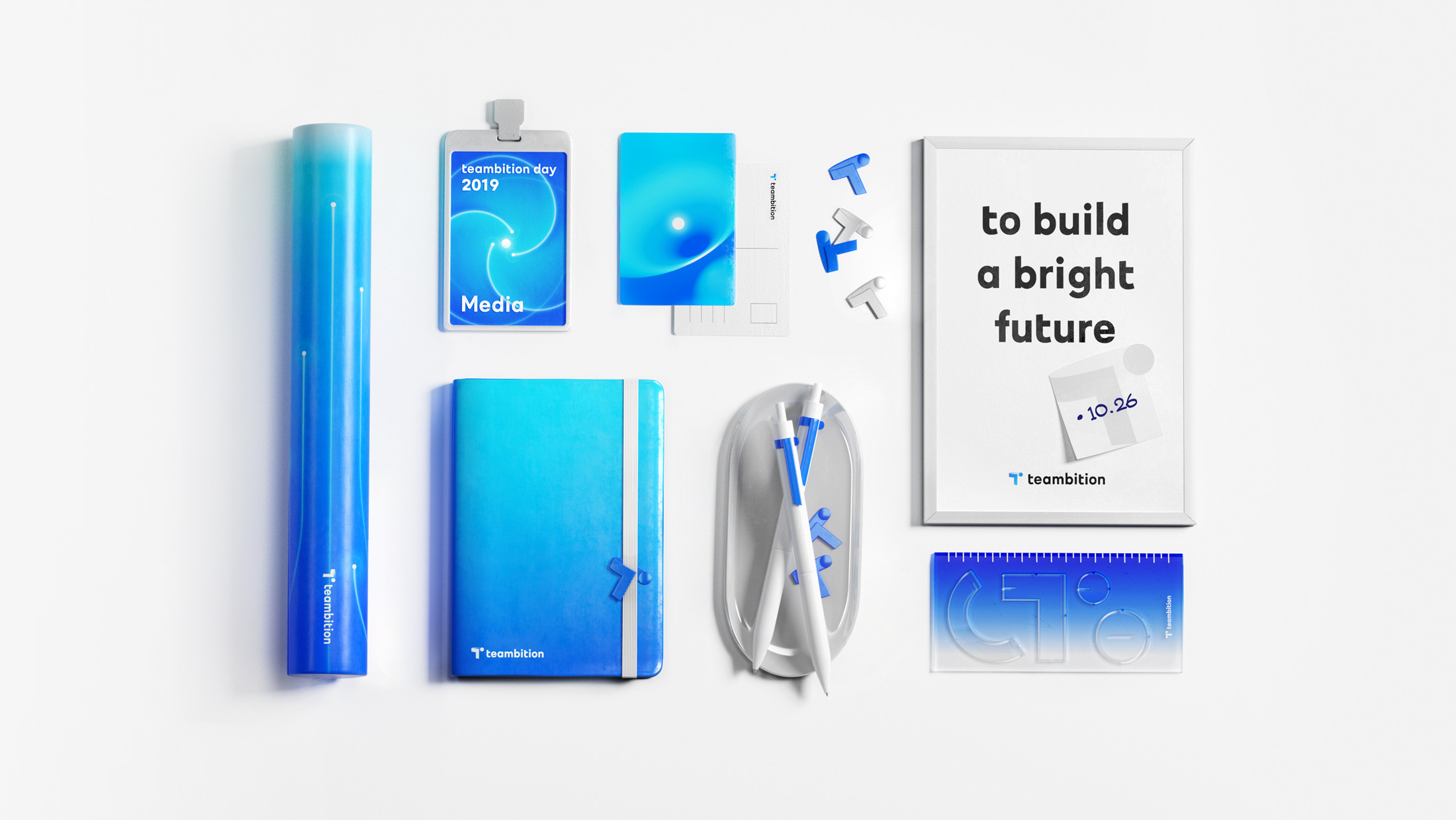
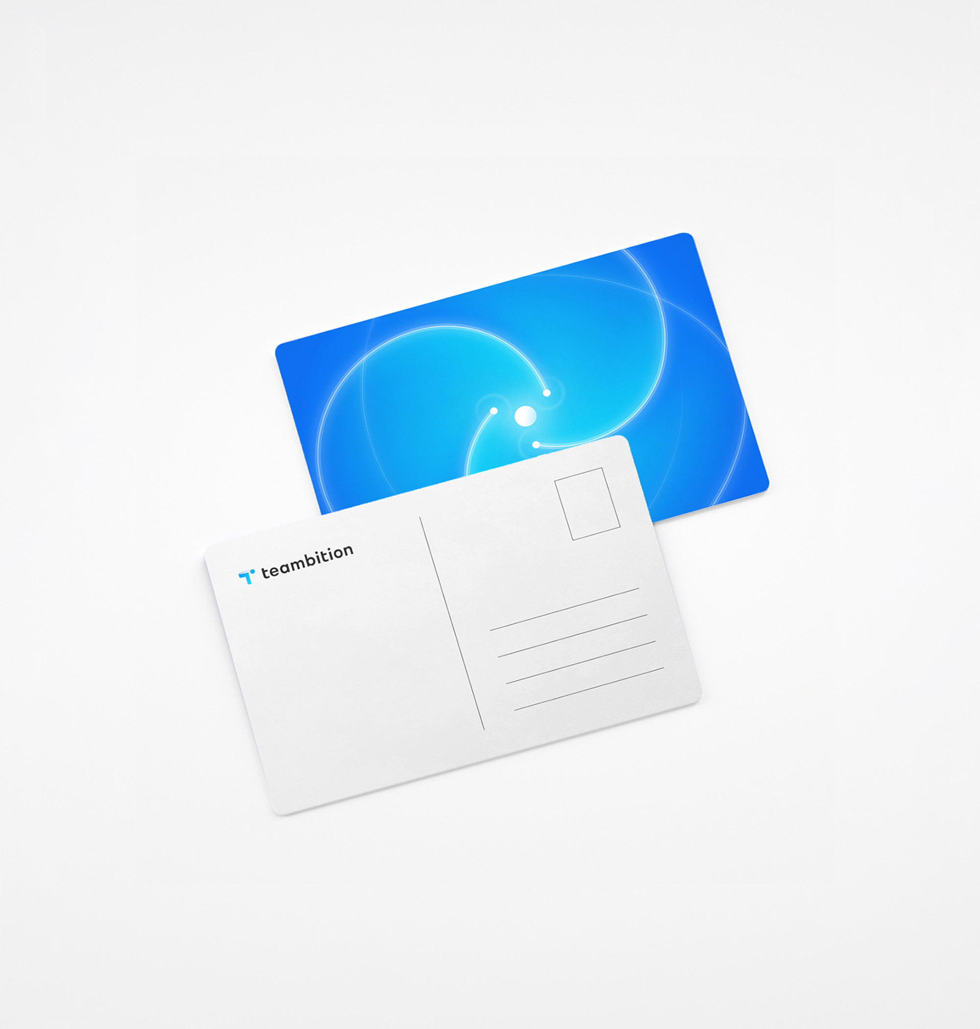
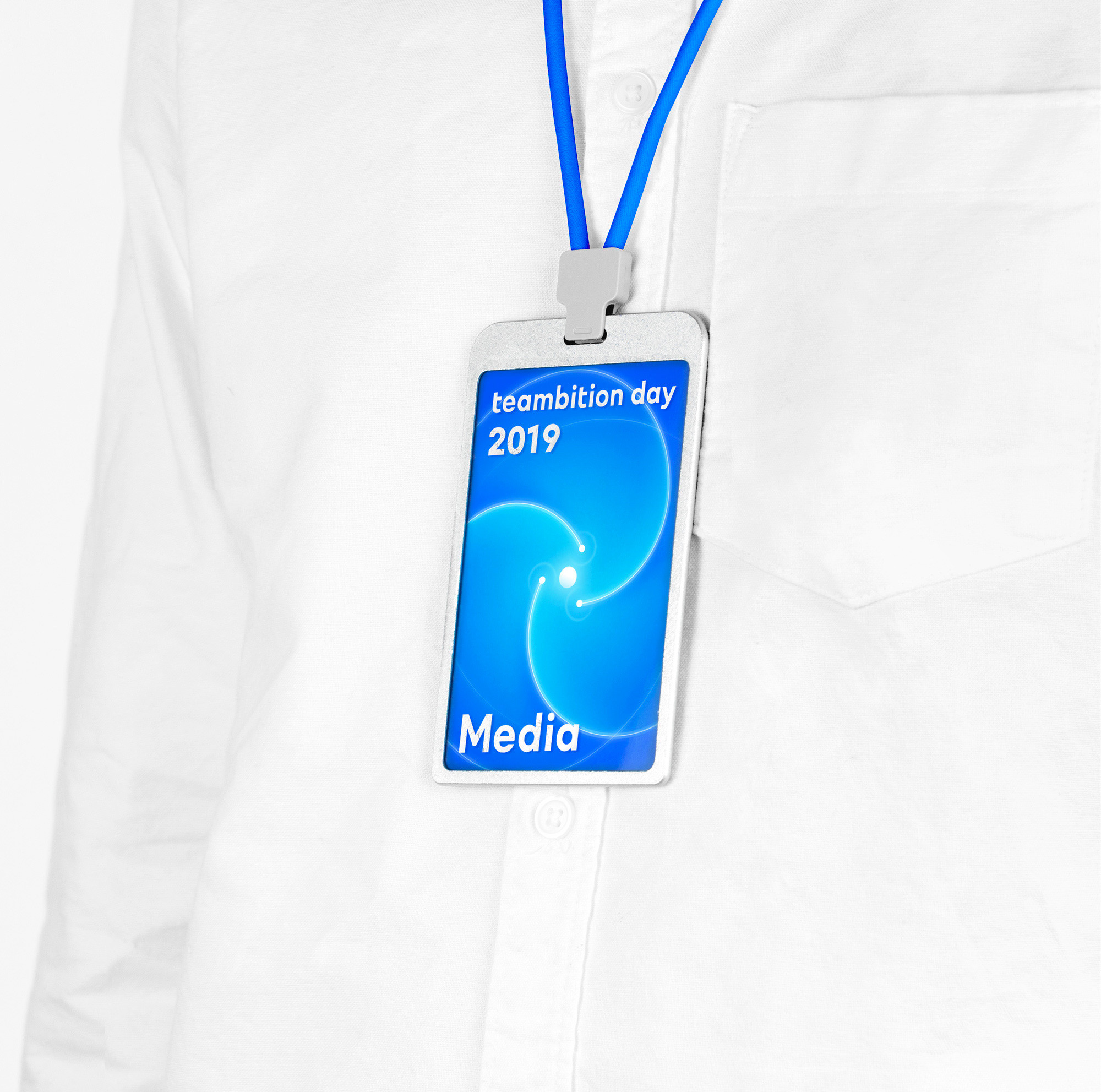
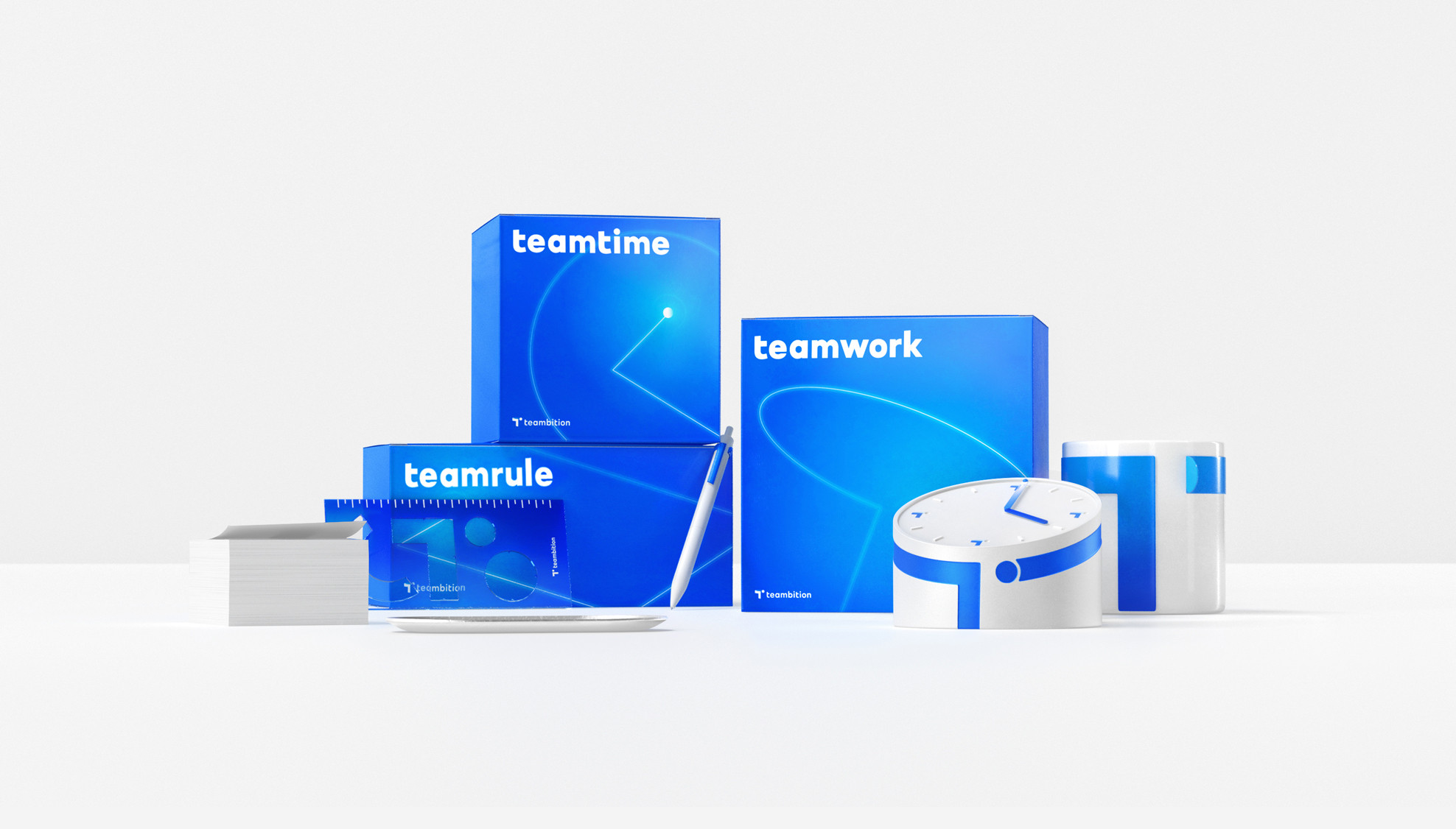
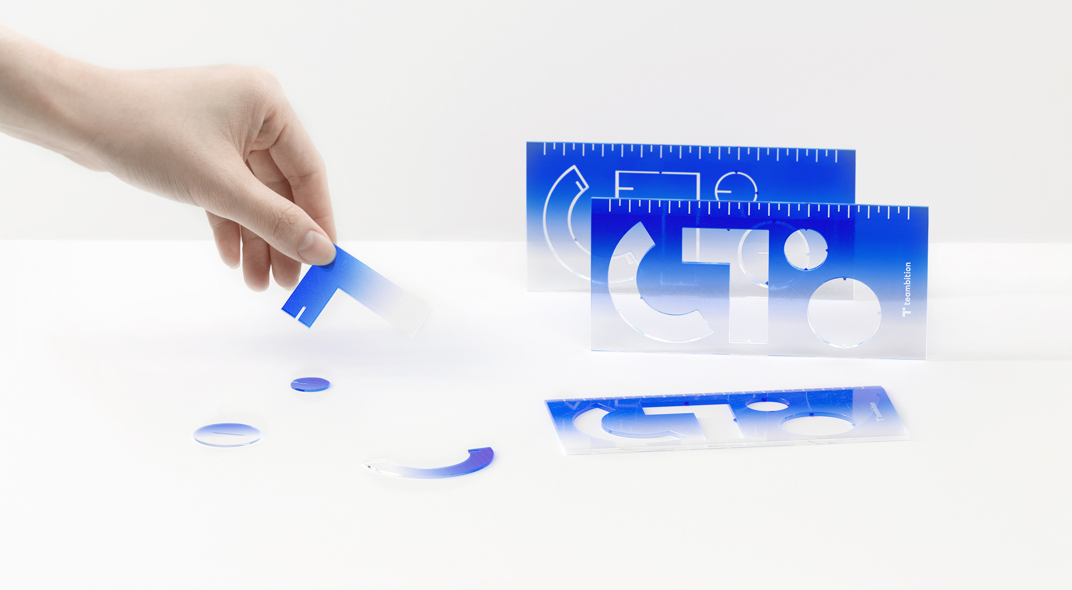
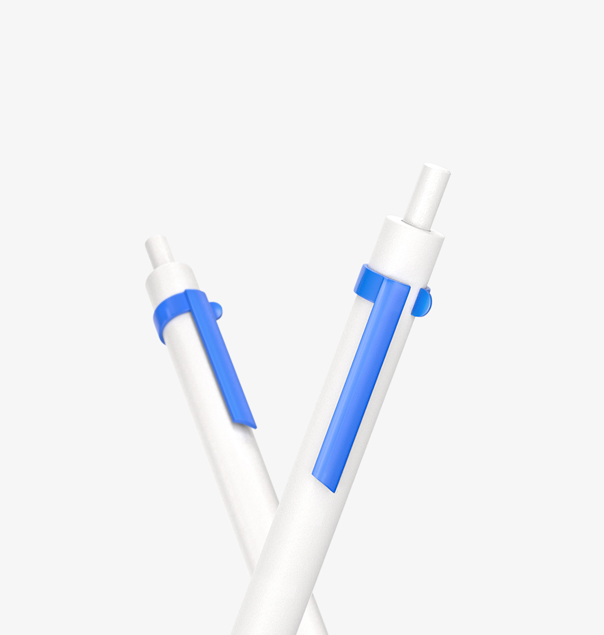
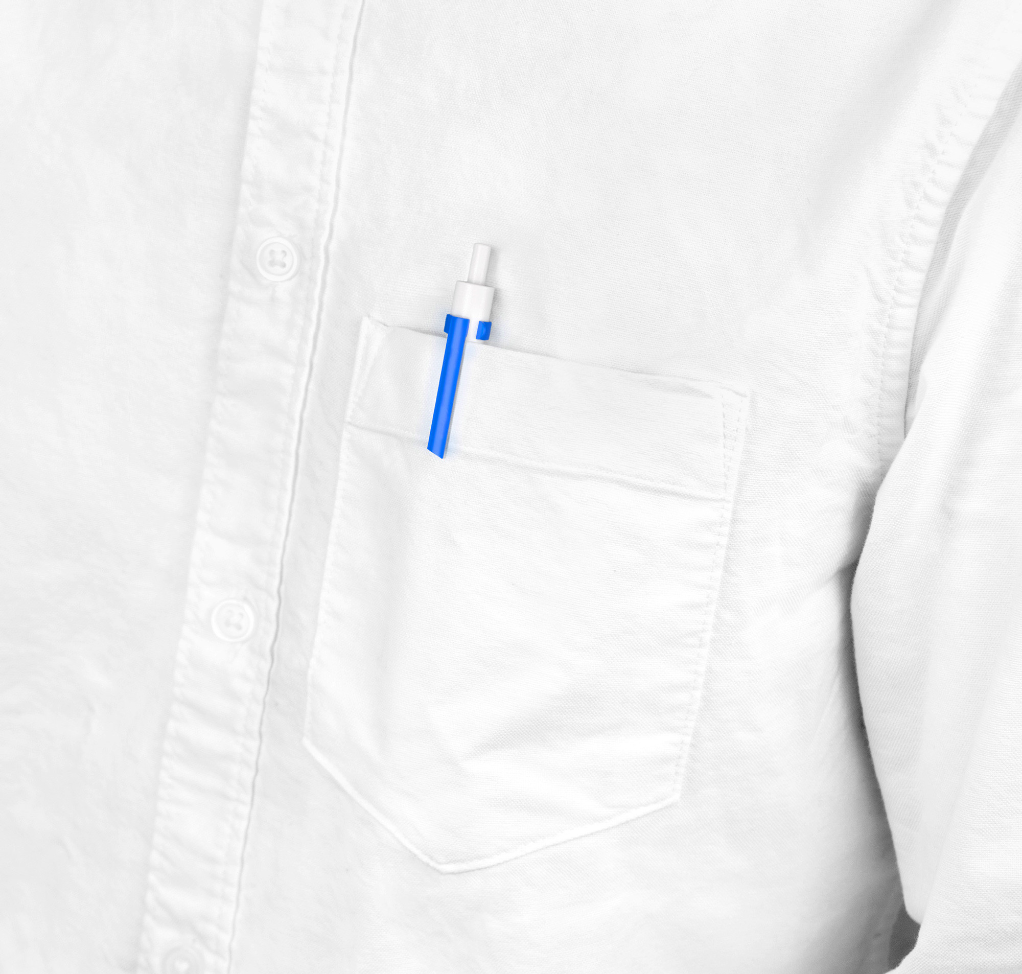
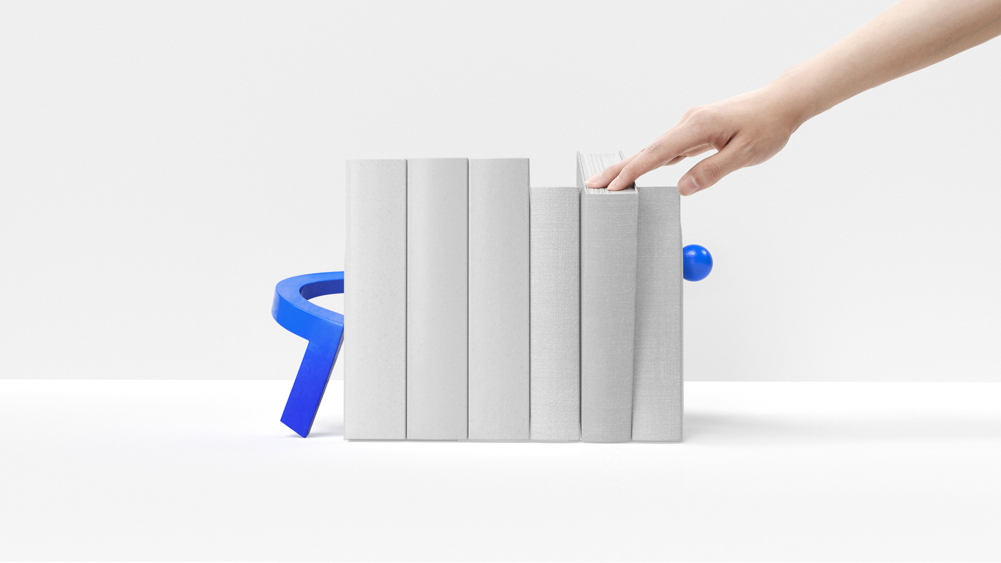
In terms of brand extension, the visual identity continues to leverage the gradient visual language while creatively incorporating the dual-element design concept of the logo: combined posters, dual-layer printed invitations, reversible tote bags, clocks with overlapping digital hands, and dual-purpose rulers. These elements not only build the brand’s visual identity but also imbue it with a unique and innovative language. Through these design extensions, Teambition emphasizes the core idea of team collaboration and co-creation.
Teambition
Enhancing a new team
collaboration platform
Brand applications
Teambition is a pioneer of team collaboration platforms in China. By facilitating the easy sharing and discussion of tasks, file sharing, and scheduling, Teambition enables teams to unlock unlimited potential in their collaboration efforts. The brand’s new logo also embodies greater possibilities. As the name suggests, the logo features the initial ‘T’ combined with a dot representing ‘team’ and an upward arrow symbolizing ‘ambition,’ creating a unique brand emblem. The gradient colors depict an upward, dynamic visual, symbolizing a positive and goal-oriented vision for team collaboration.
In terms of brand extension, the visual identity continues to leverage the gradient visual language while creatively incorporating the dual-element design concept of the logo: combined posters, dual-layer printed invitations, reversible tote bags, clocks with overlapping digital hands, and dual-purpose rulers. These elements not only build the brand’s visual identity but also imbue it with a unique and innovative language. Through these design extensions, Teambition emphasizes the core idea of team collaboration and co-creation.