wanpy
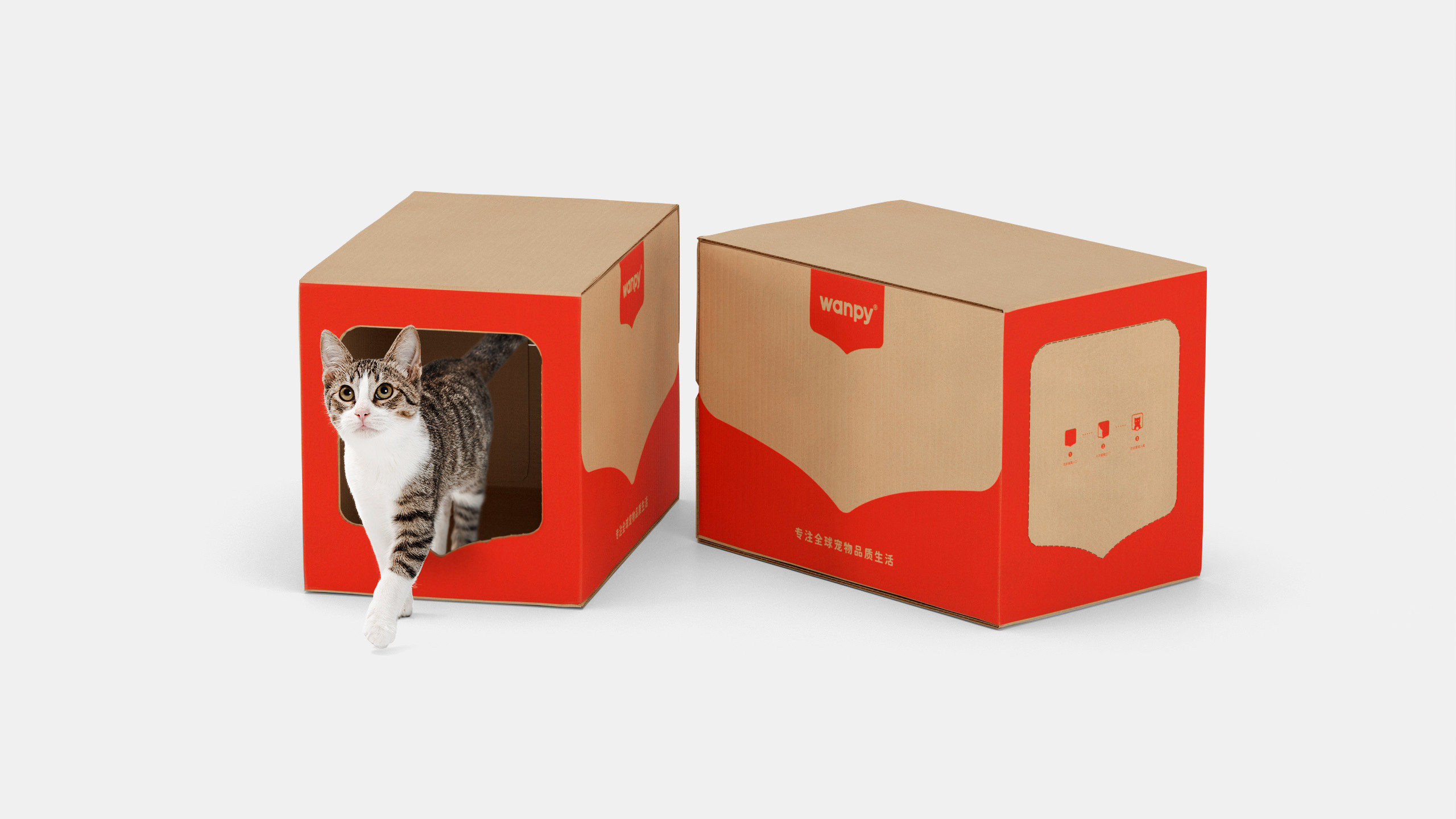
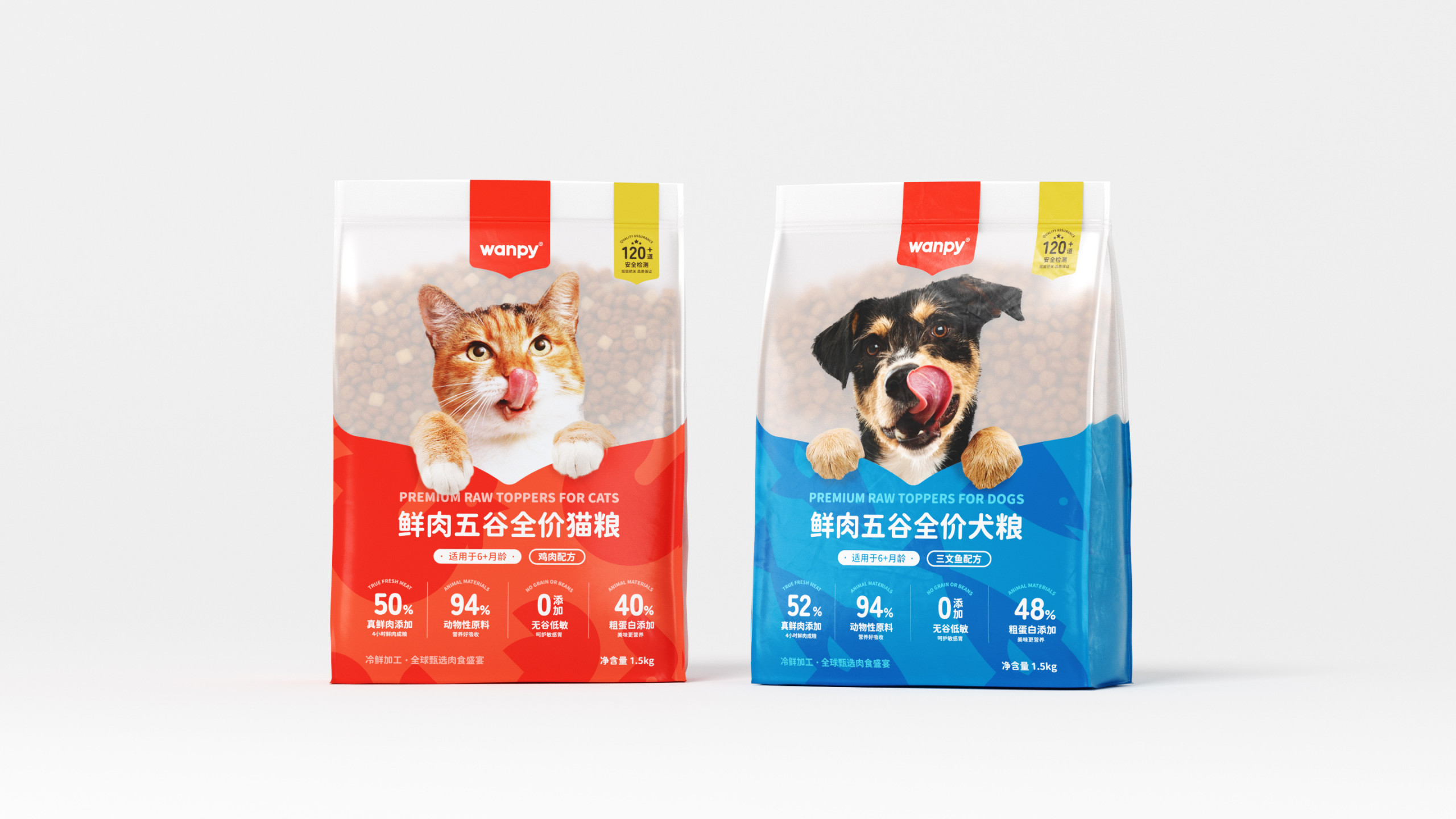
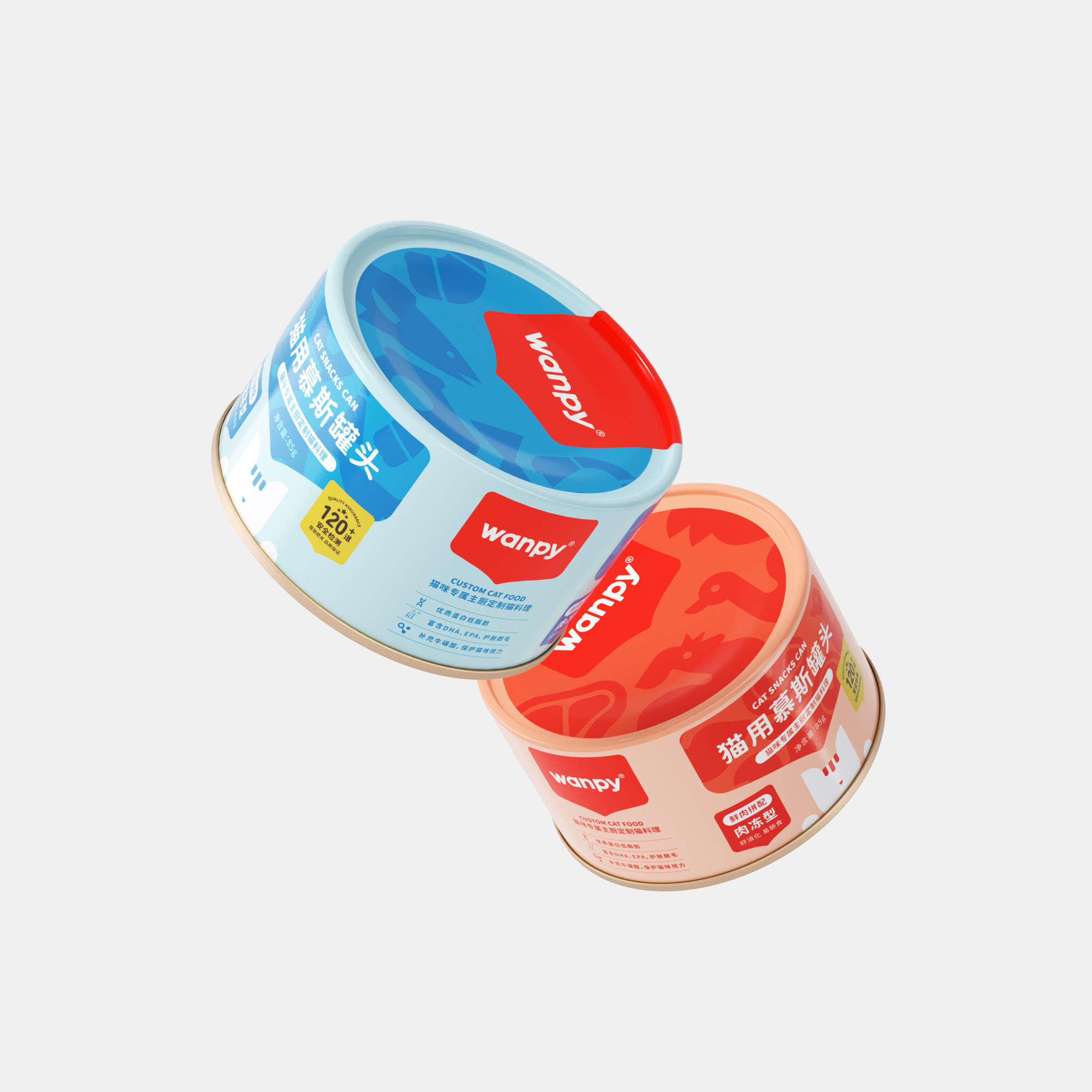
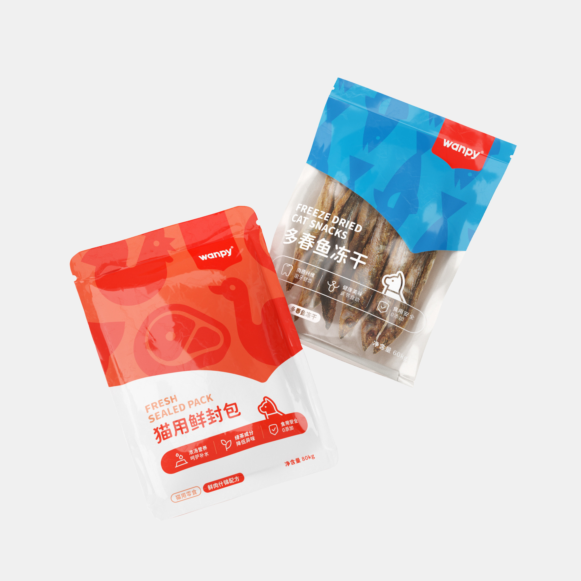
Package design
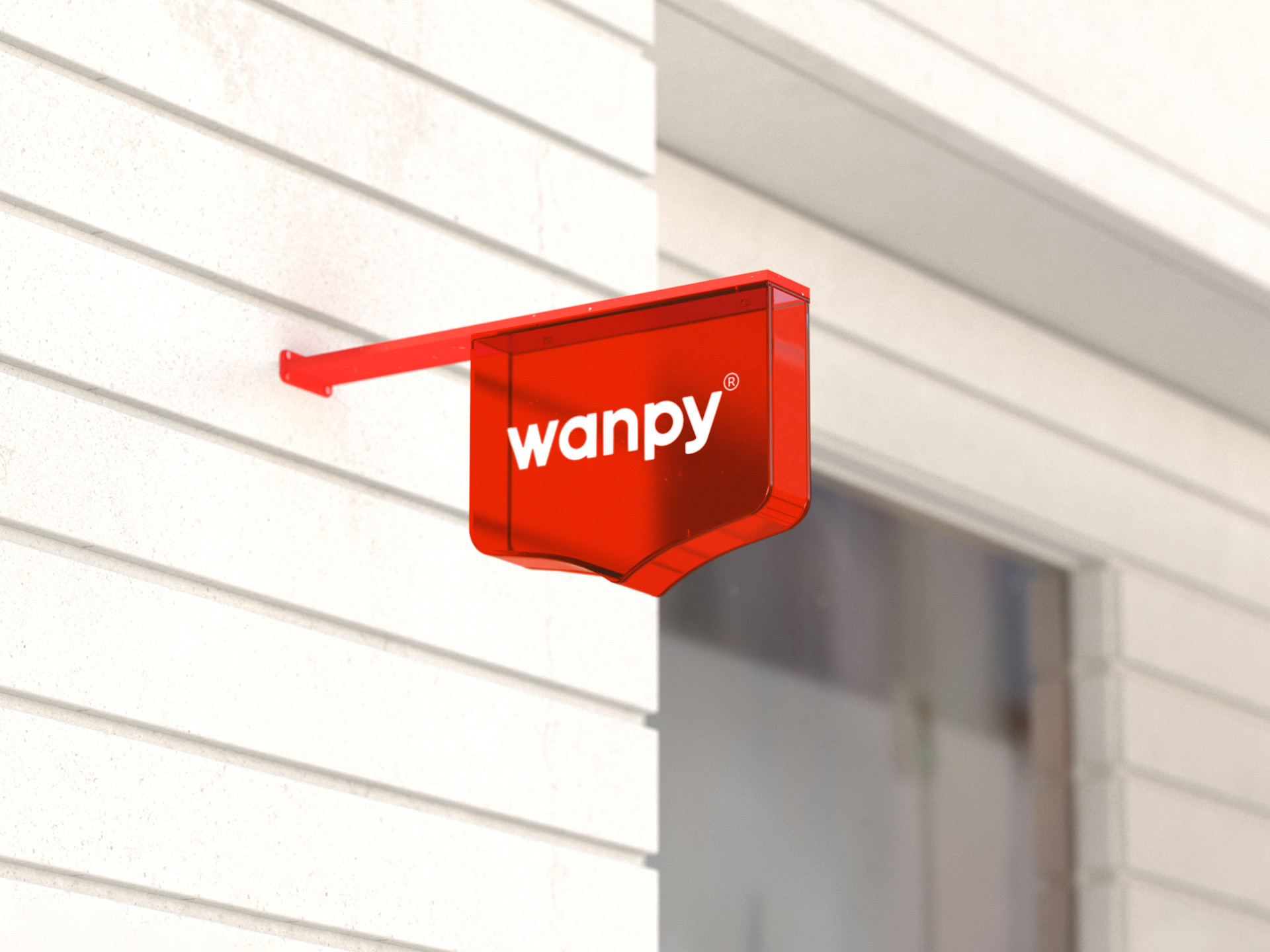
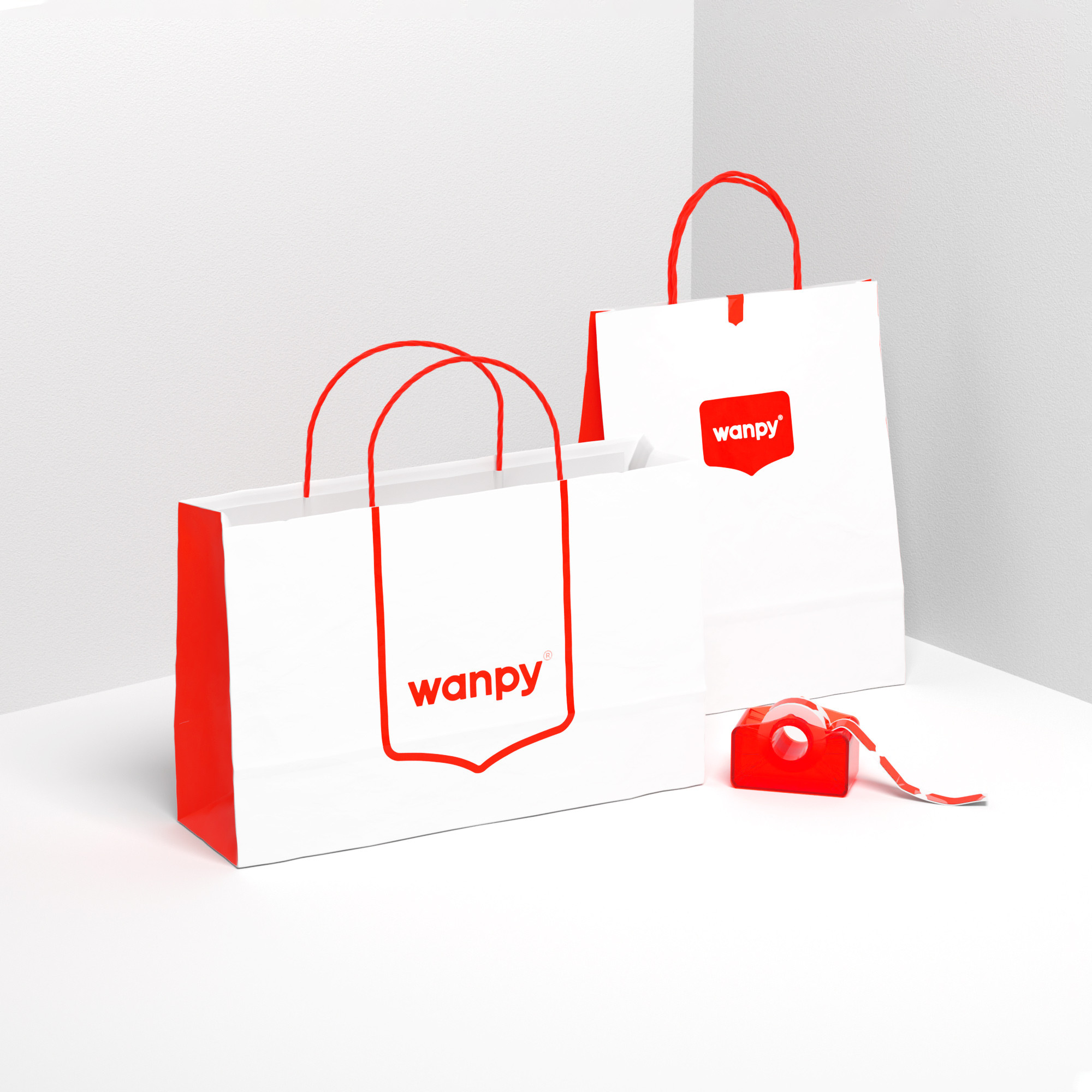
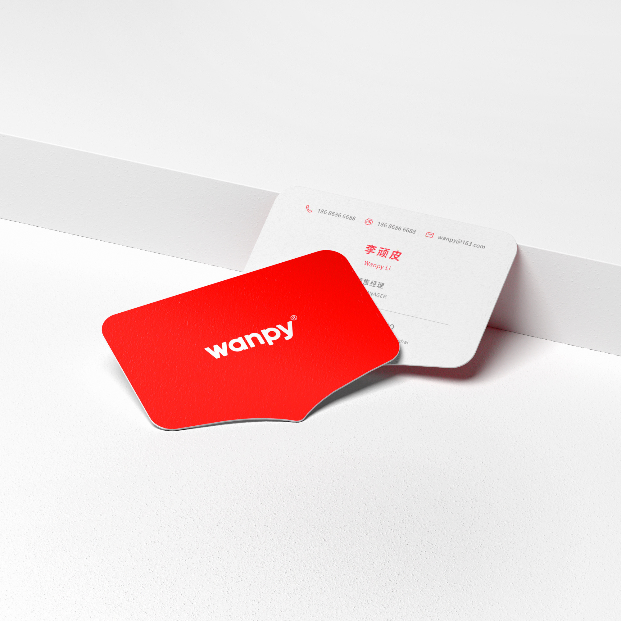
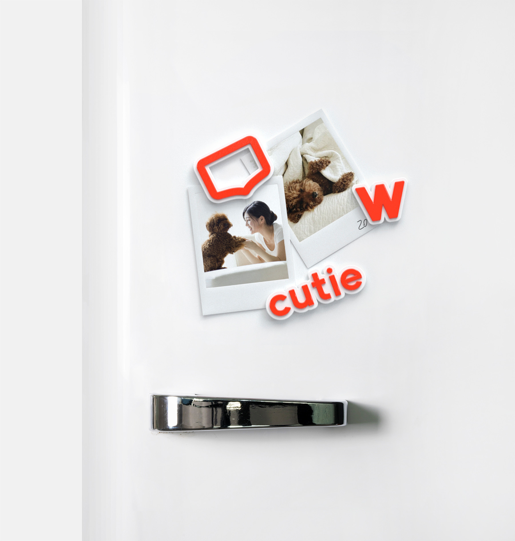
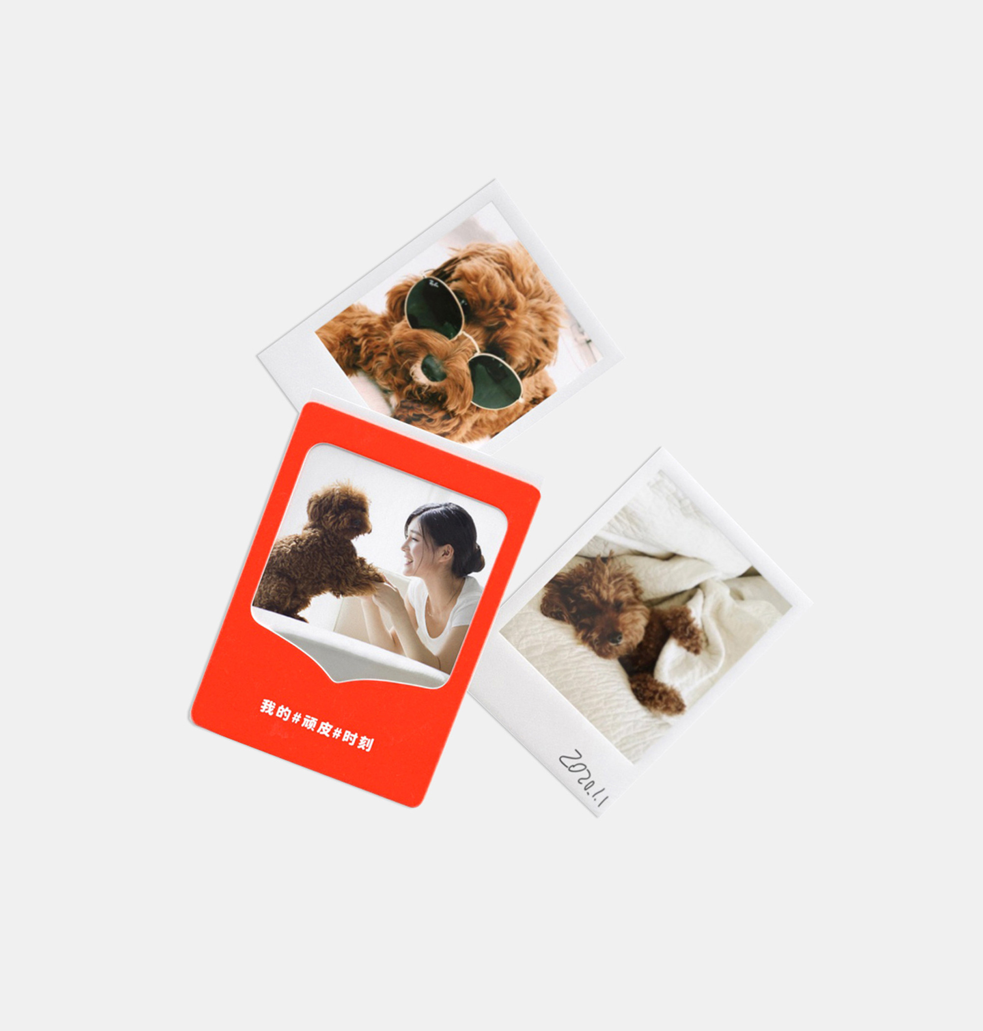
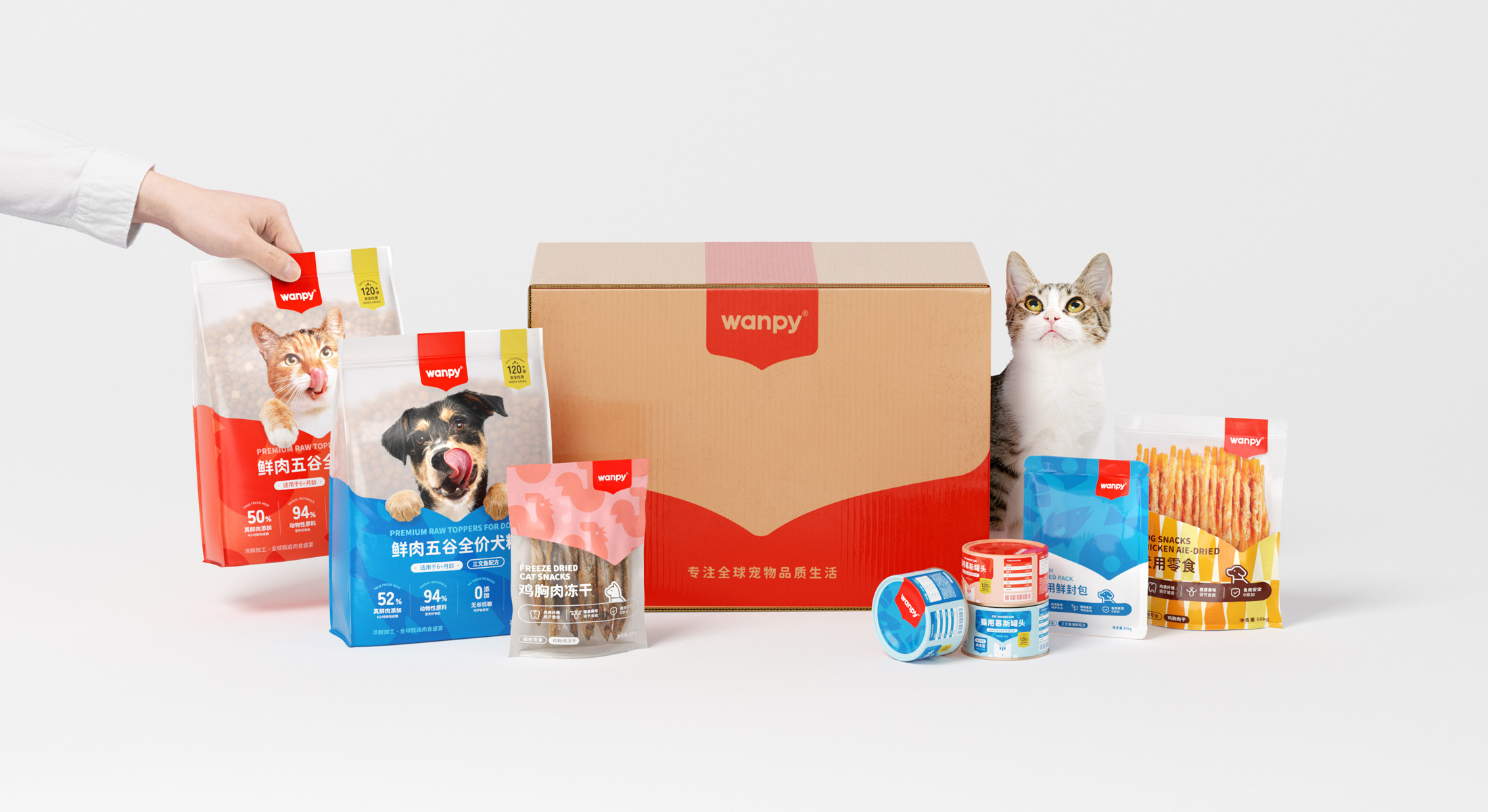
Brand applications
A meaningful rebrand
for a top pet food brand
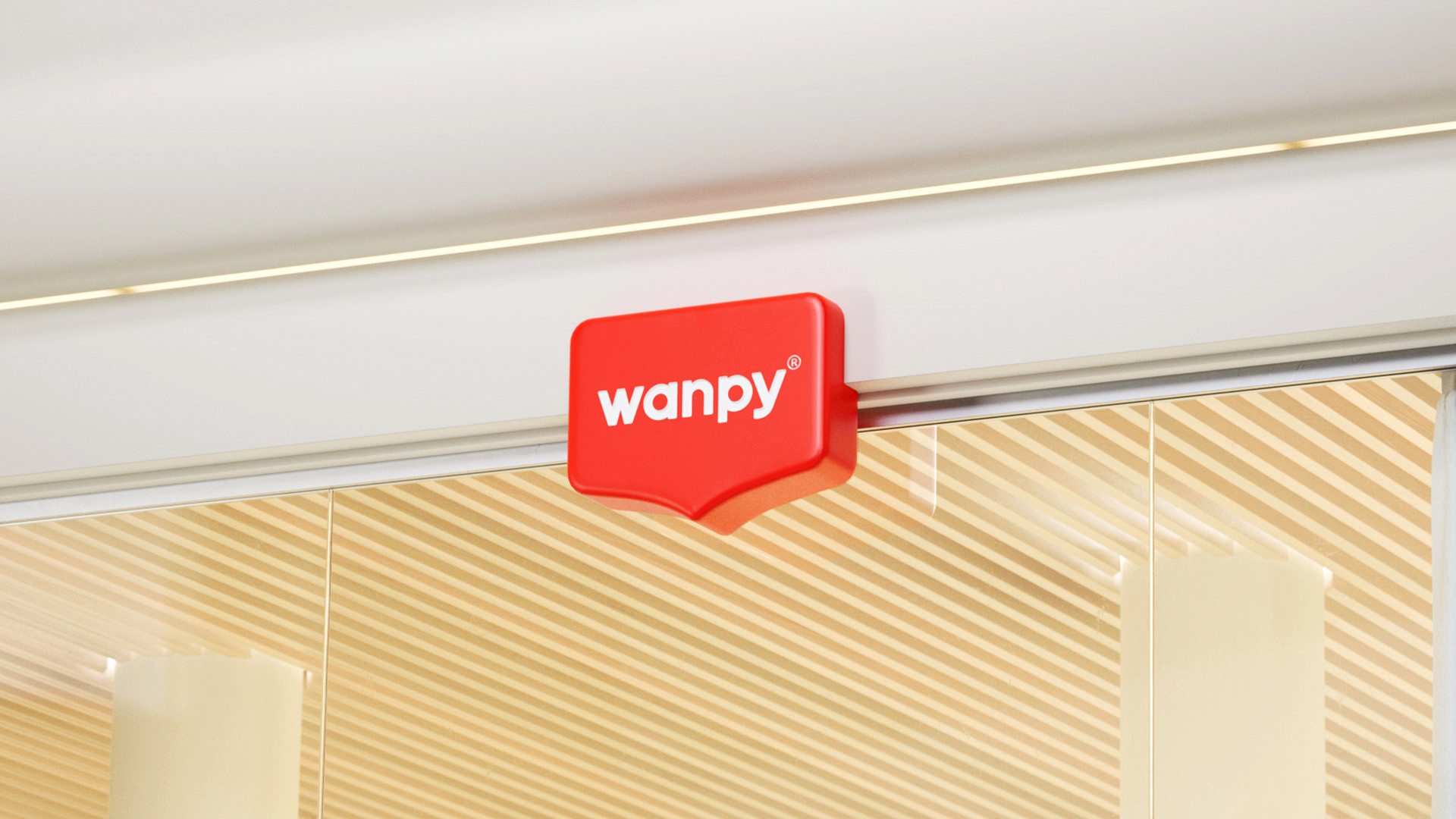
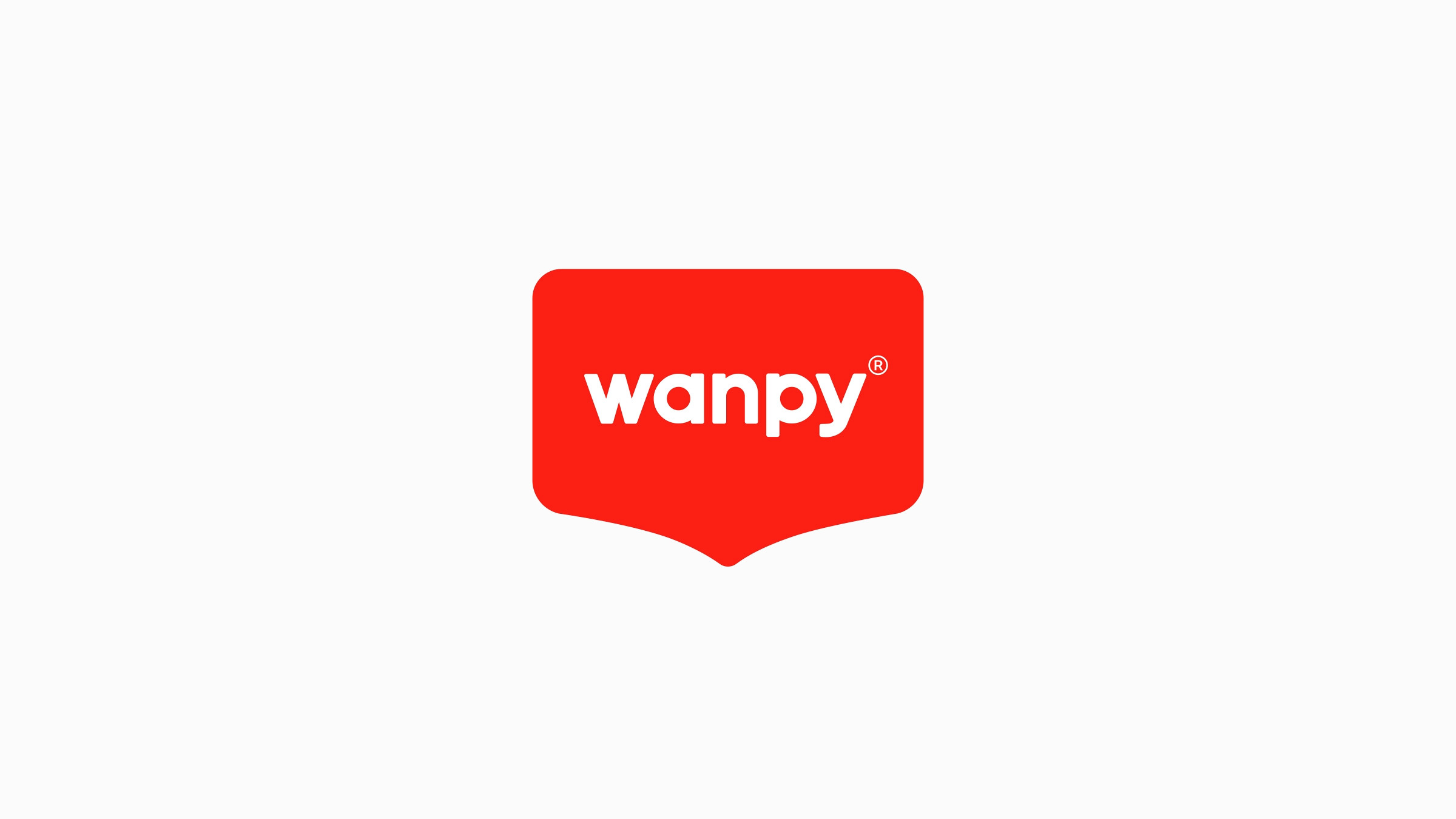
Wanpy, as part of Yantai China Pet Foods Group, is one of the leaders in the pet food industry. With tens of years of history, Wanpy has built a consistent quality and reliable brand image for consumers. To expand the market and get closer to the modern and younger audience, Wanpy wanted to renew its brand image.
Through our research, we clarified the most important brand assets of the existing brand identity: the brand red color and the badge-like brand logo. However, because of the hard and sharp shape of the logo and the uncertainty of the meaning, the existing badge shape logo shows a serious and conservative image, especially with the dark red brand color, generating a feeling of distance. Regarding the issues of the existing brand image, the goal of the reforming is clear: We want to break the cold and distanced brand image by adjusting the shape of the logo and graphic, what’s more important,
wanpy
A meaningful rebrand
for a top pet food brand
Package design
Brand applications
Wanpy, as part of Yantai China Pet Foods Group, is one of the leaders in the pet food industry. With tens of years of history, Wanpy has built a consistent quality and reliable brand image for consumers. To expand the market and get closer to the modern and younger audience, Wanpy wanted to renew its brand image.
Through our research, we clarified the most important brand assets of the existing brand identity: the brand red color and the badge-like brand logo. However, because of the hard and sharp shape of the logo and the uncertainty of the meaning, the existing badge shape logo shows a serious and conservative image, especially with the dark red brand color, generating a feeling of distance. Regarding the issues of the existing brand image, the goal of the reforming is clear: We want to break the cold and distanced brand image by adjusting the shape of the logo and graphic, what’s more important,
After
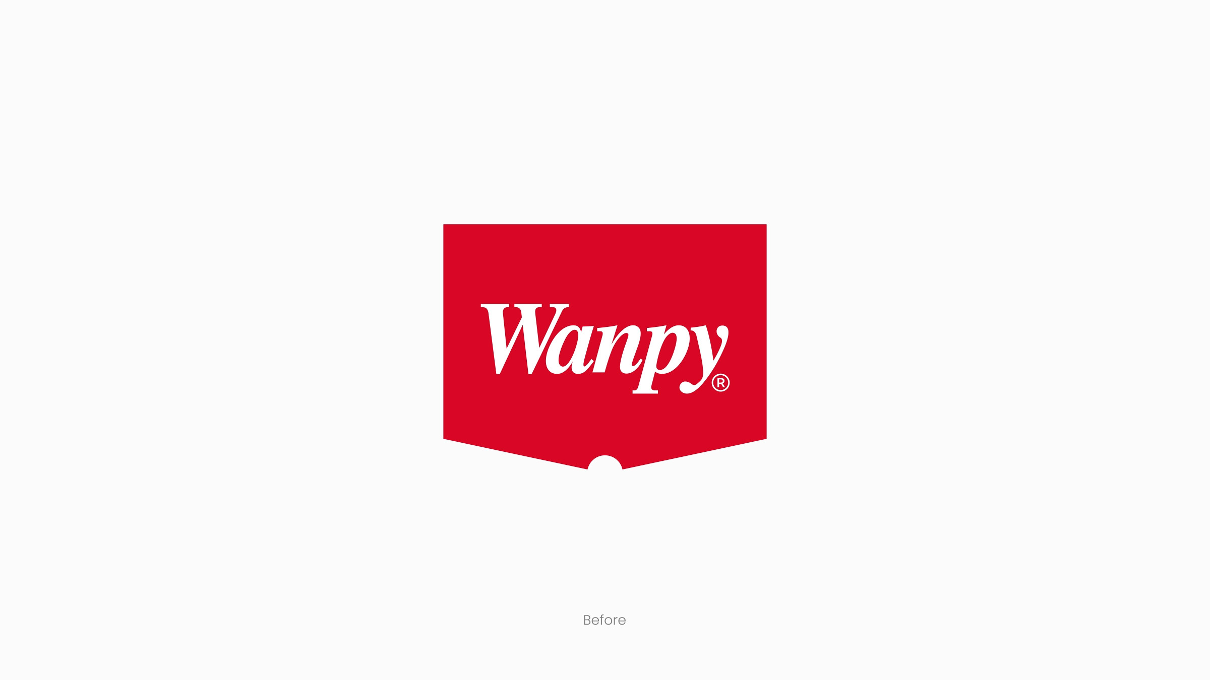
Before